Sunac Shanxiao Real Estate Sales Center by Qingtao Ji |
Home > Winners > #95271 |
 |
|
||||
| DESIGN DETAILS | |||||
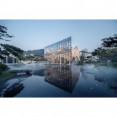
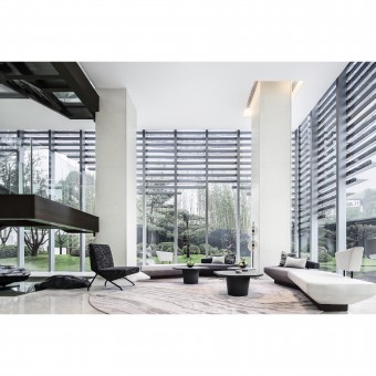
| DESIGN NAME: Sunac Shanxiao PRIMARY FUNCTION: Real Estate Sales Center INSPIRATION: Inspiration comes from famous architectural vocabulary of Peter Eisenman, architecture is only the ontology of TEXT, and other factors are needed to make it meaningful.The designers set lots of elements such as dots, lines, and planes in the space. Through the interaction between the basic geometric elements and the natural environment, changes are formed, so that visitors can perceive the rhythm of natural changes, experience the resonance between man and nature, giving vitality to the space. UNIQUE PROPERTIES / PROJECT DESCRIPTION: The target clients for the project are social elites with higher education background. Therefore, it needs to convey impressive personality characteristics and cultural symbols in the space. On the basis of creating aesthetic space, the designer moderately introduced the design idea of deconstruction, used geometric forms and linear elements extensively in the space, and endowed the space with unique sense of fashion and literary temperament through the collision of Chinese and Western cultures. OPERATION / FLOW / INTERACTION: The surrounding area of the sales center is landscaped with themes such as pine trees, spring water, cloud and mist. The main body of the building made of full glass curtain wall is like a glass box placed in the mountain forest. The interior and exterior landscapes are completely integrated. Humans and nature interact in all directions, allowing visitors to fully experience the original ecological natural environment of the space. PROJECT DURATION AND LOCATION: Design Cycle: May 2018-April 2019 Construction Period: May 2019-October 2019 Completion Time: 10 October 2019 Project Location: Nanshan Scenic Spot, Chongqing, China FITS BEST INTO CATEGORY: Interior Space and Exhibition Design |
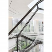
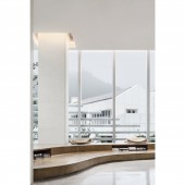
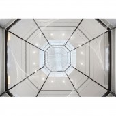
PRODUCTION / REALIZATION TECHNOLOGY: This project is located at the highest peak of Nanshan Scenic Spot in Chongqing. It is located at the ancient site with a history of 4000 years where King Yu tamed the flood. During the Second World War,this area once gathered the most elite cultural groups in China. Therefore, how to convey the landscape advantage and special temperament of the project location is the main concern for the designer. Spatial planning: the building in the sales center is an almost completely transparent glass box with a two story structure of full glass curtain wall. In addition to the necessary sand table display area, the entire spatial design mainly focused on experience. The interior space is almost completely open. Functional areas such as the reception area, tea room, and negotiation area are arranged in the area near the window, so that visitors can experience the beautiful landscape of surrounding mountains, springs and clouds from all angles. Space color: three colors such as yellow, black and white are adopted, and an elegant, atmospheric brand image are created through changes of the shape and material. Spatial characteristics: the designers built a two storey polygonal metal frame in the interior, and installed thousands of translucent metal wire. Through the winding, weaving and rotating, a layer of constantly changing artistic rendering was increased between the real natural beauty and human's subjective feeling. The device did not have any functions, but expressed rich space changes, forming the biggest feature of the project. SPECIFICATIONS / TECHNICAL PROPERTIES: The construction area for the project is 800 square meters. There are two floors in total. TAGS: Commercial space, interior design, deconstructionism, natural integration, color RESEARCH ABSTRACT: Moderate combination of modernism design technique and deconstruction design idea in commercial space; Geometric forms and lines are used to create unique artistic atmosphere in the space; Creation of an impressive sense of space; Communication between man and nature; Integration of original ecological environment and modern living space CHALLENGE: As commercial space, the biggest challenge is to create space atmosphere that correctly reflects the brand image and unique spatial impression. Based on project positioning, the designers analyzed the cognitive level of target clients, and decided to introduce the design idea of deconstruction on the basis of conventional modernism space design. Abstract lines and forms are used to cut and change the space, forming a unique aesthetic impression. Eventually it was transformed into deep memories. ADDED DATE: 2019-12-10 03:26:42 TEAM MEMBERS (5) : Ji Qingtao, Yu Ren, Xiao Yao, Hong Mei and Xiong Conghao IMAGE CREDITS: Photographer: Zhang Qilin team PATENTS/COPYRIGHTS: Copyright: Chongqing Mocun Interior Decoration Design Consulting Co., Ltd. |
||||
| Visit the following page to learn more: http://t.cn/AigkNV3i | |||||
| AWARD DETAILS | |
 |
Sunac Shanxiao Real Estate Sales Center by Qingtao Ji is Winner in Interior Space and Exhibition Design Category, 2019 - 2020.· Read the interview with designer Qingtao Ji for design Sunac Shanxiao here.· Press Members: Login or Register to request an exclusive interview with Qingtao Ji. · Click here to register inorder to view the profile and other works by Qingtao Ji. |
| SOCIAL |
| + Add to Likes / Favorites | Send to My Email | Comment | Testimonials | View Press-Release | Press Kit |
Did you like Qingtao Ji's Interior Design?
You will most likely enjoy other award winning interior design as well.
Click here to view more Award Winning Interior Design.


