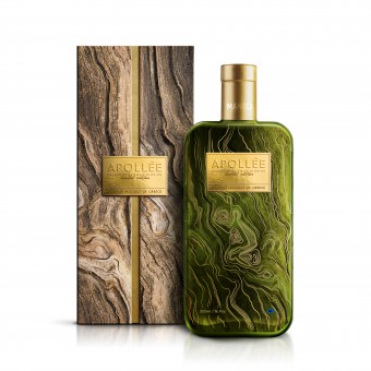
Apollee Olive Oil Packaging by Antonia Skaraki |
Home > Winners > #94658 |
 |
|
||||
| DESIGN DETAILS | |||||
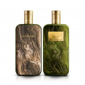
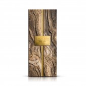
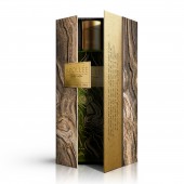
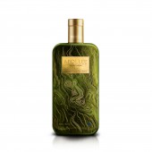
| DESIGN NAME: Apollee PRIMARY FUNCTION: Olive Oil Packaging INSPIRATION: The inspiration for creating the brand identity for the Apollee, the Manoli Canoli Premium Olive Oil, came from the origins of the founders, their birth land, the place where Apollo, the god of light, was born, the place where the olives which offer us a supreme extra virgin olive oil are born. Greece. Immerse yourself in the soul of Apollee. This packaging design invites the contemporary connoisseur to experience the boundary pushing flavor and aroma of a premium olive oil. UNIQUE PROPERTIES / PROJECT DESCRIPTION: Welcome to an adventurous journey towards the sense of the sublime. Feel the mystique surrounding a strictly limited production. Experience the extraordinary. Unusual shapes and materials in packaging design always grab our attention. So, inspired by olive tree trunks, this design nods to the bond between Mother Nature and her children, while the high quality materials lend a tactile feel and a lasting impression. OPERATION / FLOW / INTERACTION: The packaging managed to turn consumers into adventurous travelers to the magic land of olive oil. A part of the brand story and USPs of the product were added on the lateral sides of the packaging, thus inviting the consumer not only to examine the product, but also to establish a communication between him or her and the brand. PROJECT DURATION AND LOCATION: The project began and finished in 2019 in Athens, Greece. FITS BEST INTO CATEGORY: Packaging Design |
PRODUCTION / REALIZATION TECHNOLOGY: Glass & Paper. Environmentally friendly. SPECIFICATIONS / TECHNICAL PROPERTIES: Bottle (by Bruni Glass): capacity 515, total height 222, body diameter 88.3, glass weight 500 Box: 244 x 95 TAGS: Apollee, Olive oil, Packaging, Design, Storytelling, Special Edition, Manoli Canoli RESEARCH ABSTRACT: Competition mapping and analysis: A thorough market research was conducted in order to frame the market, the competitors and the potential buyers. In addition, mood boards were formed to better express the values and ethos of the company, and to agree on a direction and a design concept. CHALLENGE: The brief was to create unique artisanal packaging for an Extra Premium Product. A brand mark that would feel fresh and sophisticated at the same time! The elements and the gold-and-earthy color palette that was used successfully convey the exceptional quality of this unique olive oil, placing sophistication at the forefront, while paying homage to the Greek heritage. ADDED DATE: 2019-11-27 13:11:23 TEAM MEMBERS (3) : Creative Director: Antonia Skaraki, Designers: Evri Makridis, Andreas Deskas, Valia Alousi and Copywriter: Sotiria Theodorou IMAGE CREDITS: A.S. Advertising, 2019 |
||||
| Visit the following page to learn more: http://manolicanoli.net/ | |||||
| AWARD DETAILS | |
 |
Apollee Olive Oil Packaging by Antonia Skaraki is Winner in Packaging Design Category, 2020 - 2021.· Read the interview with designer Antonia Skaraki for design Apollee here.· Press Members: Login or Register to request an exclusive interview with Antonia Skaraki. · Click here to register inorder to view the profile and other works by Antonia Skaraki. |
| SOCIAL |
| + Add to Likes / Favorites | Send to My Email | Comment | Testimonials | View Press-Release | Press Kit |
Did you like Antonia Skaraki's Packaging Design?
You will most likely enjoy other award winning packaging design as well.
Click here to view more Award Winning Packaging Design.


