DESIGN NAME:
Terark
PRIMARY FUNCTION:
Visual Identity Design
INSPIRATION:
Exploring various approaches and conducting user research are great ways of inspiration. Visually, an agreement with the client was made, which was simple and modern. The final design idea was enlightened by the movie The Matrix. Therefore, the brand identity should convey a combined feeling of sense of wonder and future technology, which exactly shows the spirit of Terark - creating a new world.
UNIQUE PROPERTIES / PROJECT DESCRIPTION:
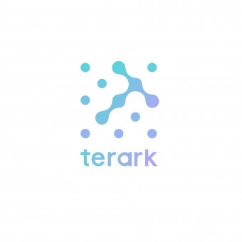
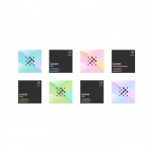
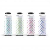
Terark is a tech company providing big data processing services. The mission of visual identity was to stand out Terark from all the competitors and demonstrate the business of the company. Finally, after iteration, the design concept was narrowed down to dot matrix with multiple kinds of gradient color. Smoothly connected dots form a shape of T, which represents the first letter of the company name. At the same time, multiple gradient shaders would be provided to customer, which enriches the use cases and also shows the business services could be expanded and beyond the expectation.
OPERATION / FLOW / INTERACTION:
First of all, brainstorming was a great way for generating multiple ideas at the beginning. However, leveraging various methods to merge ideas and evaluate ideas was difficult to some extent, which was crucial to the quality of final outcome. Therefore, the iteration of design usually took most effort in design process. Meanwhile, clients played an important role, because they could bring the insights to the specific industry. Listening to the clients was involved all the time, which ensured the final delivery met their expectation.
PROJECT DURATION AND LOCATION:
This project took 3 month from end to end. Main design part was done in San Francisco.
FITS BEST INTO CATEGORY:
Graphics, Illustration and Visual Communication Design
|
PRODUCTION / REALIZATION TECHNOLOGY:
Custom font was designed to suit in this case. Multiple gradient shaders were also provided. Moreover, a dot pattern was also delivered so that the customer could use it as the background in some print out or other materials.
SPECIFICATIONS / TECHNICAL PROPERTIES:
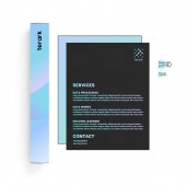
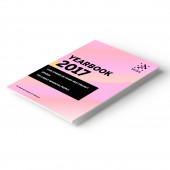
Multiple design unites were created, which were in different sizes and on surfaces such as brochures, yearbooks, name cards and water bottles.
TAGS:
Technology, branding, identity, logo, font
RESEARCH ABSTRACT:
Several rounds of qualitative research were conducted to collect feedback, in order to ensure the delivery was perceivable and appealing. The final goal was to impress the future customers of Terark, so we also reached out to the potential customers to gain more insights.
CHALLENGE:
As the branding identity was aiming to look simple and modern, it was really hard to delivery a design which could stand out from all the competitors, because they usually look very similar. How to make it special and appealing was the biggest challenge.
ADDED DATE:
2019-10-23 19:44:32
TEAM MEMBERS (1) :
IMAGE CREDITS:
Tong Wen, 2019.
|
