DESIGN NAME:
No Boundary
PRIMARY FUNCTION:
Residential Apartment
INSPIRATION:
Black and white are applied to take control over the modern sentiment, and then the warm color of wooden texture is used to adjust the color of the private space, allowing it to complement each other and introducing a sense of nature.
UNIQUE PROPERTIES / PROJECT DESCRIPTION:
This residential planning emphasizes on versatile penetration of the spatial layout, where the spatial arrangement is partitioned using axis. The front end of the entrance is the public space, using open-style arrangement for the overall planning without solid wall partitioning, breaking the spatial borderlines with no boundary, such that space and function are all-in-one.
OPERATION / FLOW / INTERACTION:
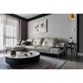
The white customized leather sofa and the round stone table brings a sense of dignity without bulkiness, structuring well-executed spatial contours. The ceiling used widthwise extended black glass lines to construct the dark lines corresponding to the white color, further reinforcing the lines of the different axis.
PROJECT DURATION AND LOCATION:
The property finished on the 23th of Feburary 2019, locates in Taichung City, Taiwan.
FITS BEST INTO CATEGORY:
Interior Space and Exhibition Design
|
PRODUCTION / REALIZATION TECHNOLOGY:
The widthwise indoor public area is composed of the living room, the dining room and the bar kitchen area, where modern contours are applied to create three different spaces, three regions in one yet all independent on its own. Light grids are used to separate the temporary and indoor spaces after entering the foyer. The combination of the white storage cabinet and the mirror extends to the living room, while the retracted white marble television wall continues the consistency in colors via different materials with same colors, but separating the living room from the dining area.
SPECIFICATIONS / TECHNICAL PROPERTIES:
The project is 100 square meters.
TAGS:
Interior Design, Residential, House, Space, Home
RESEARCH ABSTRACT:
The dining room separates from the living room and the kitchen area through a solid wood long table, where the lengthwise layout forms relativity with the living room while maintaining a spacious circulation. The kitchen is designed with an L-shaped kitchen counter bar, using white artificial stone and black mirror to express the modern sensation. The three parts of the public space use different materials together with the chroma-less integration, where the linear separation creates the 3D depth layers, allowing the kitchen to integrate into the entire spatial design.
CHALLENGE:
The rear end of the space is allocated with the private space in a widthwise direction, eliminating the passageway arrangement to optimize the spatial utilization. The master bedroom applied cocoa colored padded headboard with dignified wooden tone to enhance texture variation, while the combination of earth colors introduce elegance and dignity. The secondary bedroom used lighter colored wooden texture to introduce a sense of leisure.
ADDED DATE:
2019-10-02 03:40:56
TEAM MEMBERS (1) :
Director: Hsin Yuan Lee
IMAGE CREDITS:
Hsin-Yuan Lee, 2019.
|


