Simple Code II Saphire Smartwatch Face by Alex Pan Yong |
Home > Winners > #93223 |
 |
|
||||
| DESIGN DETAILS | |||||
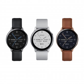
| DESIGN NAME: Simple Code II Saphire PRIMARY FUNCTION: Smartwatch Face INSPIRATION: The Simple Code II is from the first version which is just a prototype. The idea is to put the date in the center of the dial, so user can find the date effortlessly. That's it. That's where inspiration came from. After that, for further convenience, the hands became translucent so that they will not obstruct the other information behind them. Every effort is for readability while still maintain the neat. UNIQUE PROPERTIES / PROJECT DESCRIPTION: Simple Code II has a unique feature that the components, such as weather and step count, shift their position to avoid overlapping the blue hands. It is an easy-to-read watch face. The blue translucent hands not only shows the beauty, but also maintain the readability. The date is the center of the whole dial so that user can find out what the date is in a glance. In the middle, the month, the date and the day form a line which cut through the dial in half to create the visual balance. OPERATION / FLOW / INTERACTION: The dial is in dark tone with pattern as background. The hands are in translucent blue sapphire colour. The entire watch face gives a calm, modern and stylish feeling. It fits both casual and business outfit. PROJECT DURATION AND LOCATION: I started designing the prototype in May 2018. It was done in June 2018 in Singapore. FITS BEST INTO CATEGORY: Interface, Interaction and User Experience Design |
PRODUCTION / REALIZATION TECHNOLOGY: It's from the first version of a prototype called Simple Code which was done in WatchMaker app. After a few trials and changes, the ideas are getting more and more confirmed. Eventually the ideas became the second version, Simple Code II. SPECIFICATIONS / TECHNICAL PROPERTIES: Smartwatch face, 400 x 400px. Support Android watch and Samsung watch. Available for download from Facer app and WatchMaker app. TAGS: stylish, modern, precise, casual, business, calm, sapphire RESEARCH ABSTRACT: Started with a very simple idea: make it easy to read. That's why it's called "Simple Code". After done the first prototype, put in more ideas such as translucent hands and still with ease telling time. CHALLENGE: The biggest challenge is to convey the modern beauty, the comfort for eyes, the hands cannot block the information behind yet still have good looking. ADDED DATE: 2019-10-01 17:20:35 TEAM MEMBERS (1) : Pan Yong (myself) IMAGE CREDITS: Image #1: Photographer Pan Yong, Image #2: Photographer Pan Yong, Image #3: Photographer Pan Yong, Image #4: Photographer Pan Yong, Image #5: Photographer Pan Yong, PATENTS/COPYRIGHTS: Copyrights belong to Pan Yong, 2019. |
||||
| Visit the following page to learn more: http://bit.ly/3bKPxSa | |||||
| AWARD DETAILS | |
 |
Simple Code Ii Saphire Smartwatch Face by Alex Pan Yong is Winner in Interface, Interaction and User Experience Design Category, 2019 - 2020.· Read the interview with designer Alex Pan Yong for design Simple Code II Saphire here.· Press Members: Login or Register to request an exclusive interview with Alex Pan Yong. · Click here to register inorder to view the profile and other works by Alex Pan Yong. |
| SOCIAL |
| + Add to Likes / Favorites | Send to My Email | Comment | Testimonials | View Press-Release | Press Kit | Translations |
| COMMENTS | ||||||||||||||||||||
|
||||||||||||||||||||
Did you like Alex Pan Yong's Interface Design?
You will most likely enjoy other award winning interface design as well.
Click here to view more Award Winning Interface Design.


