EN Skincare Salon and Store by Yusuke Kinoshita |
Home > Winners > #93094 |
 |
|
||||
| DESIGN DETAILS | |||||
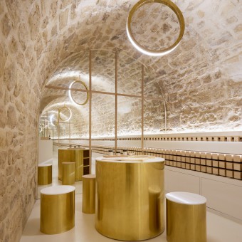
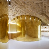
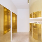
| DESIGN NAME: EN Skincare PRIMARY FUNCTION: Salon and Store INSPIRATION: Adding a series of circular partitions across four rooms and two levels to gently define the various functions of the space. This leans into the Japanese hospitality principal of discovery; patrons must wind through the store to find each treatment area, rather than walking into an obvious open-plan. The unusual geometric forms serve to spark curiosity in the customer. The concept of ‘beauty’ by choosing golden polished brass for the circular partitions and accent pieces throughout the store. UNIQUE PROPERTIES / PROJECT DESCRIPTION: Designed for new Japanese cosmetics brand En, the store occupies of an 18th-century building in the centre of the French capital. The name "En" translates as "beauty" in Japanese, but can also mean "circle" and "connection&quo OPERATION / FLOW / INTERACTION: The space cut off by the circle partitions connects all the required functions. This remaining space between the existing walls and the integrated circle partitions creates a geometrically curious form and an original circulation with an aesthetical experience. The customer cannot get into each service rooms directly, but must walk along a winding path toward the destination. This method that let the visitors walk along and enhance his expectation is typical Japanese way of hospitality, as in the traditional tea culture. PROJECT DURATION AND LOCATION: Project started in December 2017 and opened to public at July 2019 in paris. 7 Rue de Condé75006 Paris FITS BEST INTO CATEGORY: Interior Space and Exhibition Design |
PRODUCTION / REALIZATION TECHNOLOGY: The external surfaces of the circle partitions are finished in polished brass to bring a distorted and warm reflection. This beautiful expanded space creates the feeling for the visitor step into an elegant and extraordinary world. SPECIFICATIONS / TECHNICAL PROPERTIES: The existing 150 square meter spaces were divided into 4 main rooms: 2 rooms with stone vaulted spaces in the basement and 2 rooms finished with white plaster on the ground floor. A different scale of circles is composed for each room to create a functional plan. Room1: the entrance and the boutique, Room2: the counseling and the treatment space, Room3: the hall and the massage space, Room4: the product gallery and the blending counter. TAGS: Skincare, brass, paris, japan RESEARCH ABSTRACT: The site has prime Parisian location, in the 6th arrondissement steps from the Jardin de Luxembourg. We preserved most of the existing structure of the 18th-century building, adding a series of circular partitions across four rooms and two levels to gently define the various functions of the space. This leans into the Japanese hospitality principal of discovery; patrons must wind through the store to find each treatment area, rather than walking into an obvious open-plan. The unusual geometric forms serve to spark curiosity in the customer, enchanting them to delve deeper into the store. CHALLENGE: Merging two history and culture, between French and Japanese. Mixing culture in a strong clear story is always a challenge. Once we could figure out this strong idea, then we believe this new story could attract the people. ADDED DATE: 2019-09-30 20:08:35 TEAM MEMBERS (1) : Yusuke Kinoshita IMAGE CREDITS: Photography is by David Foessel PATENTS/COPYRIGHTS: Photography is by David Foessel |
||||
| Visit the following page to learn more: http://www.archiee.com/ | |||||
| AWARD DETAILS | |
 |
En Skincare Salon and Store by Yusuke Kinoshita is Winner in Interior Space and Exhibition Design Category, 2019 - 2020.· Press Members: Login or Register to request an exclusive interview with Yusuke Kinoshita. · Click here to register inorder to view the profile and other works by Yusuke Kinoshita. |
| SOCIAL |
| + Add to Likes / Favorites | Send to My Email | Comment | Testimonials | View Press-Release | Press Kit |


