DESIGN NAME:
Timeline
PRIMARY FUNCTION:
Commercial Space
INSPIRATION:
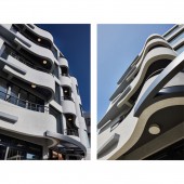
Returning to the core value of architecture as a part of the environment, the key elements of this design are durability, practicality, and aesthetics. Despite the sharp triangular shape, the narrowness and the elongation of the construction site, the designer employed a curved design, softening the profile of the building and maximizing usable space. As for the coordinating of light and shadows, the designer utilized French windows to make the layering of each floor distinct. On the whole, bright colors were chosen to form flexible and tranquil sections.
UNIQUE PROPERTIES / PROJECT DESCRIPTION:
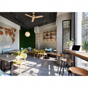
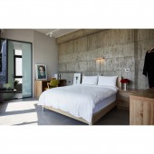
Under the limitations of a boat-shaped construction area, the project aimed for maximum comfort and quality of stay and optimized the use of the site, constructing an interior that better utilizes the space. To create a style in which the space is in harmony with the environment is also one of the main focuses of this project, hence the softening of the triangular site through the usage of curved lines. In this overall soft loft, the concrete in its bare state, the temperature of wooden furniture, and the bright view from the arched balcony bring both physical and mental relaxation to the guests.
OPERATION / FLOW / INTERACTION:
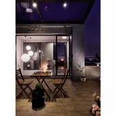
Since the project was carried out under limited funds and space, the designer strived for maximum and optimum utilization of space by utilizing curved lines and elevations. Using an arched terrace to help ease the angular appearance of the building. Coordinating light and shadows by employing natural light coming from the French windows and dividing areas utilizing difference of height, in search for smart aesthetics in which architecture and the environment coexist.
PROJECT DURATION AND LOCATION:
The project finished in 2019, in Taichung, Taiwan.
FITS BEST INTO CATEGORY:
Architecture, Building and Structure Design
|
PRODUCTION / REALIZATION TECHNOLOGY:
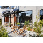
Under the pressure of limited funds and a limited site, this project adopted gray-toned concrete paired with roughcast. Multicolored walls create a warm atmosphere for this stretched location. The slew of French windows on the first floor links the inside with the outside, giving guests a glimpse of the outdoors relaxation area where space is perfectly utilized and where they are welcome to rest in. In this soft loft, moon shaped pendant lights help with giving imagination and expectations to each room.
SPECIFICATIONS / TECHNICAL PROPERTIES:
Approximately 340 square meters and consists of two family rooms, three double rooms, and a dining area on the roof terrace. Inconsecutive elevations are used in this project to expand on space while an arched terrace helps ease the angular appearance of the building. Considering the fact that, after completion, this this building is going to be used as a hostel where guests should be able to relax and restore energy, the space is chiefly in a gray tone and the walls are decorated with bright colors, giving the guests a simple yet vibrant impression of the room while they fully unwind.
TAGS:
Simplicity, Comfort, Curvature, Triangular site softening, Optimum utilization
RESEARCH ABSTRACT:
This project is all about creating harmony with the environment to capture the forgotten notes of life. Under the tough conditions of this project, the designer expanded on the angular construction site by using different elevations, maximizing indoor space. The texture of bare concrete paired with the arching of the terrace ease the sharpness of the original lines and create a brand new view. The once disadvantageous limitations were turned into a fresh perspective. With the help of simple colors and soft items, the designer was able to create an oasis in the desert that is modern life.
CHALLENGE:
The first and foremost challenge was the site itself, since it was elongated, has an acute angle and the fact that its front yard is a non-building site. The designer analyzed the meaning of architecture in the face of the environment and created a design that is aesthetically pleasing but not flamboyant. In order to confront the limitations of the site, the designer installed a lot of French windows to extend both the inside and the outside. And the usage of curvatures gives the whole construction a more mellow and varied look.
ADDED DATE:
2019-09-30 14:39:03
TEAM MEMBERS (1) :
Wei-Tong Chen
IMAGE CREDITS:
Wei-Tong Chen, 2019.
|
