DESIGN NAME:
Simple Living Scene
PRIMARY FUNCTION:
Residence
INSPIRATION:
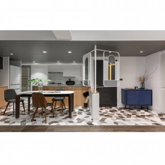
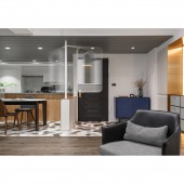
As the overall interior is imbued with a neutral and reserved spatial quality, as favored by the client, complemented by the outgoing and direct personality articulated in sharp and clean linework embellished by geometric octagonal floor tile, et., in making a modern and youthful ambiance. And with consideration by the client regarding spatial aesthetics and Fengshui, the windmill-styled visual screen has brought about a flowing and energetic symbolism.
UNIQUE PROPERTIES / PROJECT DESCRIPTION:
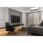
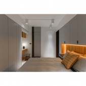
As this is a renovation of an old residence of over 30 years with antiquated status, along with a dramatic change in the living pattern of the inhabitants, the design team aimed at bringing this residence more aligned with modern and future living needs with aligned spatial axes and simple color layout.
OPERATION / FLOW / INTERACTION:
As old residences are generally with low ceiling height, and the residence of this project has a structural beam hanging over the entrance, therefore the design team created ceiling height drop to beautify the existing visual imperfection while making degradation of spatial layers.
PROJECT DURATION AND LOCATION:
The project was completed in February 2019, in Kaohsiung City, Taiwan.
FITS BEST INTO CATEGORY:
Interior Space and Exhibition Design
|
PRODUCTION / REALIZATION TECHNOLOGY:
Lotos Plaster, Mortex Imported Waterproofing Paint, Timber-Patterned Tile, Timber Flooring, Marble, Chocolate Brick, Steel-Brushed Timber Veneer, System Board, Masonry Benchtop, Metal Rack, Glass
SPECIFICATIONS / TECHNICAL PROPERTIES:
The interior area is of 92 square meters with a layout consisting of entrance, living room, open dining area, and kitchen with 3 bedrooms and 2 bathrooms.
TAGS:
Old Residence Renovation, Modern Minimalism, Light, Residential Design
RESEARCH ABSTRACT:
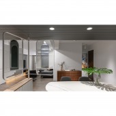
As the dimension of this house is very common for small family residences in Taiwan, it also features the common traits of the traditional old housing such as limited natural lighting. However, the design team opted to open up the kitchen and applying modern spatial linework and light colors complemented by suspended cabinet volumes and lighting fixture, while the open kitchen also expanded the kitchen-dining domain which also changed the family dynamics, hence the family interaction mode.
CHALLENGE:
As the residence is antiquated, not only did the original layout does not satisfy requirement of modern living, the less than ideal circulation created many odd corners, so all the improvements need to be done with minimum modifications as expected by the client. The issues that attracted the most attention were leaks, wall cancers, and insect infestation, etc., which shall be rectified for the sustainable living for the inhabitants.
ADDED DATE:
2019-09-30 13:27:39
TEAM MEMBERS (1) :
IMAGE CREDITS:
Sean Chang
|


