Unto Communication Tool Corporate Identity by Unto |
Home > Winners > #92669 |
 |
|
||||
| DESIGN DETAILS | |||||
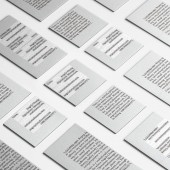
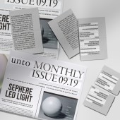
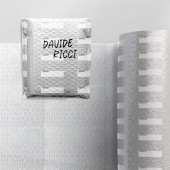
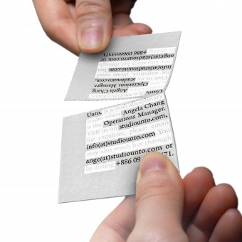
| DESIGN NAME: Unto Communication Tool PRIMARY FUNCTION: Corporate Identity INSPIRATION: Like many others, the brand identity is an opportunity for the business to introduce themselves from the very first interaction, for example, by handing out a name card. And for this design studio, they would like to communicate their brand language, through challenging ways of experiencing such traditional communicative tools, name card, flyer, and wrapping paper by amplifying its function and introducing new user experiences. UNIQUE PROPERTIES / PROJECT DESCRIPTION: Name cards and product wrapping have been necessary assets for individuals and brands to take on with a dash of their individuality. The team explores not only the graphics that go on but the functional limitations. Returning the essential function of a name card, which is connecting, by suggesting the card to be split into two and encouraging the user to keep one and share one, the design aims to increase the connections that one name card can make, and one social networking scene could offer. OPERATION / FLOW / INTERACTION: The info on the card is in a dense paragraph format, presented twice, one upside down on top of another, a perforated line subtly parts the two paragraphs, encouraging the reader to tear apart for a more convenient read. The user is then encouraged to give out the other half of the card. One side of the card shows a full paragraph as if orally making a self introduction, the opposite side is highlighting only the necessary. The flyer is a traditional newsprint form, where as the bubble wrap, versatile for packaging purposes, use the patterned brand name to fill the receiver info. PROJECT DURATION AND LOCATION: The project started in July till September 2019, in Taipei. FITS BEST INTO CATEGORY: Graphics, Illustration and Visual Communication Design |
PRODUCTION / REALIZATION TECHNOLOGY: UV print method for translucent white on black ink, die-cut perforated line, UV print on the external layer of bubble wrap. SPECIFICATIONS / TECHNICAL PROPERTIES: Name card 9cmx5.4cm, Newsprint A3, Bubble wrap 5 ft. long x 12 in. wide x 5in, Perforated every 12in. A thick layer of film with a bubble on one side, the other side custom print pattern. TAGS: Name card, branding identity, sharable name card, experiential branding, customizable wrapping, six degrees of separation, second degree connection design RESEARCH ABSTRACT: The theory of Six Degrees of Separation navigates as the primary concept in design thinking. In a world of 7 billion people, it seems that we are all connected by six or fewer acquaintances. And since internet networking has widely expanded our online acquaintances, the six people is lowered to four. Using the ancient way of advertising, word of mouth, this first-degree connection who received the name card is encouraged to extend the relationship to a second. Inspired to increase the connections that one name card can make, or one social networking scene could offer. CHALLENGE: The challenge here is trying to express the brand identity of experimental design, not only using graphics as communication but as a psychological medium that leads to action. The team decided to play with user experience and the intuition to tear along a perforated line and the satisfaction of it. And to weave together a visual recognition of brand identity using minimal elements, so that it may be distinctive but does not overpower the focus of user experience. ADDED DATE: 2019-09-29 08:36:19 TEAM MEMBERS (2) : Ming Hsi Chou and Ching Yi Angela Chang IMAGE CREDITS: Image#1: Ming Hsi Chou, creator, 2019, Image#2: Ming Hsi Chou, creator, 2019. Image#3: Ching Yi Chang, creator, 2019. Image#4: Ching Yi Chang, creator, 2019. Image #5: Ming Hsi Chou, 3D artist, 2019. PATENTS/COPYRIGHTS: © 2019 Studio Unto. All Rights Reserved. |
||||
| Visit the following page to learn more: http://www.studiounto.com | |||||
| AWARD DETAILS | |
 |
Unto Communication Tool Corporate Identity by Unto is Winner in Graphics, Illustration and Visual Communication Design Category, 2019 - 2020.· Press Members: Login or Register to request an exclusive interview with Unto. · Click here to register inorder to view the profile and other works by Unto. |
| SOCIAL |
| + Add to Likes / Favorites | Send to My Email | Comment | Testimonials | View Press-Release | Press Kit |


