Winetime Seafood Packaging by Olga Takhtarova |
Home > Winners > #92361 |
 |
|
||||
| DESIGN DETAILS | |||||
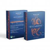
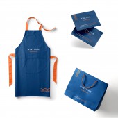
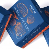
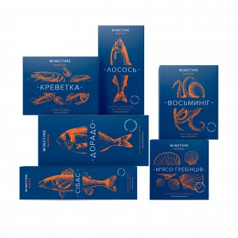
| DESIGN NAME: Winetime Seafood PRIMARY FUNCTION: Packaging INSPIRATION: Winetime Seafood is a new series of fish and other seafood products that combines more than 10 products: wild dorado, salmon, European bass, Nile perch, scallops, octopus, tiger shrimps, etc. The technology of shock (quick) freezing allows the products to preserve the structure, nutritional value, and maximum taste. UNIQUE PROPERTIES / PROJECT DESCRIPTION: The new design emphasizes all the advantages of the brand: the colors reflect the gastronomic nature of the product; unique style and well-arranged design emphasize the solid attentive attitude of the manufacturer to the product, which escalates loyalty to delicacies taste; the packaging looks bright, perceptible and does not require extra effort from the buyer while making a choice. All this makes the product more attractive to consumers and helps to make a purchasing decision quicker. OPERATION / FLOW / INTERACTION: In addition, each item of the series has its own separate visual element – an image and an inscription - which allows the buyer to understand easily what he or she has got: an octopus, perch, shrimp or other. This approach, on one hand, preserves the unity of brand perception, and on the other hand, makes a specific product search simpler. Three main brand colors chosen by the designer are deep blue - the color of the deep sea, bright orange - the company color, and pure white - a symbol of freshness. A sans serif font compliments the overall picture. PROJECT DURATION AND LOCATION: Ukraine, Kyiv, the project began in December 2018 and ended in May 2019 FITS BEST INTO CATEGORY: Packaging Design |
PRODUCTION / REALIZATION TECHNOLOGY: The designer decided that the Winetime Seafood packaging should demonstrate the reliability of the brand and convey the freshness of the products. For this, a single unique concept was developed, and the visual information strategy was used. The entire series packaging is developed in a single unique style. This approach compiles the assortment under one brand and distinguishes the series Winetime Seafood from products of other manufacturers presented in retail chains. SPECIFICATIONS / TECHNICAL PROPERTIES: boxes 100mm x 100 x 40mm, 150mm x 330mm x30mm, 350mm x 180mm x 50mm, 360mm x 100mm x60mm TAGS: seafood, fish, frozen food, packaging, branding RESEARCH ABSTRACT: The designer considered the following key points. There is certain psychology of choosing colors in design — each color conveys an idea. Brightness and contrast attract attention. They are noticeable and improve the perception of information. For each item in the series special visual element was created: a picture and an inscription. The illustration helped to make the packaging more visually interesting and clear and arouse certain feelings among buyers. CHALLENGE: The packaging had to convey the quality and reliability of the brand, inspire to buy. First of all, effective elements had to be discovered so that they tell about the taste and quality of the product, emphasize the attentive manufacturer’s attitude. And also the packaging had to be harmonious, understandable and not overloaded with the information. The second challenge was to create an emotional image that would appeal to the target audience and distinguish packaging from competitors. ADDED DATE: 2019-09-26 15:59:16 TEAM MEMBERS (1) : IMAGE CREDITS: Imagines №1-5 are used images www.shutterstock.com www.freepik.com |
||||
| Visit the following page to learn more: https://sotdesign.com/ | |||||
| AWARD DETAILS | |
 |
Winetime Seafood Packaging by Olga Takhtarova is Winner in Packaging Design Category, 2019 - 2020.· Press Members: Login or Register to request an exclusive interview with Olga Takhtarova. · Click here to register inorder to view the profile and other works by Olga Takhtarova. |
| SOCIAL |
| + Add to Likes / Favorites | Send to My Email | Comment | Testimonials | View Press-Release | Press Kit | Translations |


