Antme Corporate Identity by Donggyun Kang |
Home > Winners > #92227 |
 |
|
||||
| DESIGN DETAILS | |||||
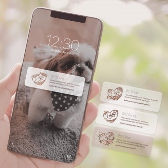
| DESIGN NAME: Antme PRIMARY FUNCTION: Corporate Identity INSPIRATION: Antme's business can't exist without a fundamental love for a dog. Therefore, we expressed the logo that combines the mind that connects man to dogs and the clothing of Antme as the final brand identity. UNIQUE PROPERTIES / PROJECT DESCRIPTION: Antme's brand orientations are amusement bonding, adorable design and eternal friendship. In Antme's logo system, values that the brand pursues are well melted, so the brand logo shape is completed. OPERATION / FLOW / INTERACTION: Antme's visual graphic means communion between a dog and a person. Antme's logo and motif express the fun time people and dogs interact, while also containing the roles and functions that Antme performs in it. Motifs are expressed in a way that connects a person and a dog made in the form of circles. PROJECT DURATION AND LOCATION: The project started in December 2018 and finished in March 2019 in Republic of Korea. FITS BEST INTO CATEGORY: Graphics, Illustration and Visual Communication Design |
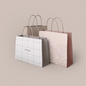
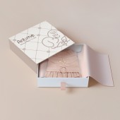
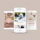
PRODUCTION / REALIZATION TECHNOLOGY: Antme's logo and motif express the fun time people and dogs interact, while also containing the roles and functions that Antme performs in it. Motifs are expressed in a way that connects a person and a dog made in the form of a circle. This motif is assembled and combined to extend into various forms of the pattern. These patterns apply to the type of on-offline media that Antme meets the world. SPECIFICATIONS / TECHNICAL PROPERTIES: Antme not simply sells dog clothing, but also designs dog clothing themselves and offers various classes for customers and their precious companion dogs. Antme was born with the genuine brand value, and based on that the project was worked. TAGS: Antme, CI, BI, Corporate Identity, Brand Identity, Branding RESEARCH ABSTRACT: We created a graphic with the meaning of connection to create a variety of application designs used within the brand. It has been applied to packages that contain products and to supplies that are needed for business. CHALLENGE: We did a lot of research to find graphics to emphasize the brand's expertise while matching cute logo. We developed such graphics by focusing on the meaning of connection. ADDED DATE: 2019-09-25 07:33:01 TEAM MEMBERS (8) : Creative director : Donggyun Kang, Creative director : Yangji Kim, Designer : Saea Kang, Designer : Jeesun Yim, Designer : Heejin Um, Designer : Habin Ku, Designer : Inhwa Song and Developer : Yumin Kim IMAGE CREDITS: Donggyun Kang, 2019. |
||||
| Visit the following page to learn more: http://bit.ly/36xV2BQ | |||||
| AWARD DETAILS | |
 |
Antme Corporate Identity by Donggyun Kang is Winner in Graphics, Illustration and Visual Communication Design Category, 2019 - 2020.· Press Members: Login or Register to request an exclusive interview with Donggyun Kang. · Click here to register inorder to view the profile and other works by Donggyun Kang. |
| SOCIAL |
| + Add to Likes / Favorites | Send to My Email | Comment | Testimonials | View Press-Release | Press Kit |


