Creative Trade Mark Raw Honey by Zanas Karenauskas |
Home > Winners > #91735 |
 |
|
||||
| DESIGN DETAILS | |||||
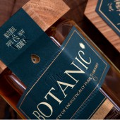
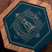
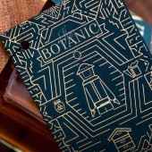
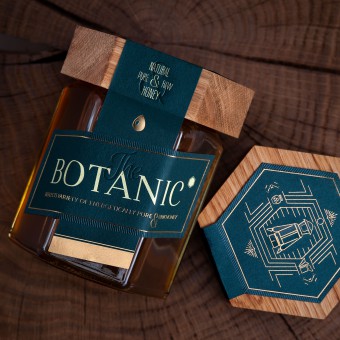
| DESIGN NAME: Creative Trade Mark PRIMARY FUNCTION: Raw Honey INSPIRATION: The aim of this packaging was to create a design that would announce its own individuality while keeping to the high quality standards and general concept of the natural honey purity. We wanted to show that the packaging reflects true balance between human and nature. To create such a feeling, we needed the special key. And the main key is the wooden lid. Each one lid are made individually by human hand from natural linden tree, whose nectar is so generously shared by bees in this jar. UNIQUE PROPERTIES / PROJECT DESCRIPTION: The Botanic - A wildly impossible, natural raw honey made from imaginative minds with unrealistic expectations for quality and taste. The packaging design concept is based on simplicity and respect for the raw materials. The label design incorporates a hexagon shape, a shape found in nature (like hexagonal snowflakes) and very reminiscent of the honeycomb. The hexagonal shape is prevalent in nature and it's considered the strongest shape known. OPERATION / FLOW / INTERACTION: The Botanic honey's new design is original down to the unique handmade wooden lid that tops each container. Each lid is hand crafted from wood from the linden tree, which was struck by lightning. By incorporating natural materials, the design of the wooden lid reflects honesty of the raw honey. The wooden lid echoes the other design elements which represent purity, natural harmony, and authenticity,values are which are the values of the beekeepers as well as our design team. PROJECT DURATION AND LOCATION: Started: June of 2019 Location: Lithuania Market Country: United Kingdom Market Region: Europe Product Category: Confectionery Consumer Packaging Format: Glass Jar, Tag Consumer Substrate / Material: Glass Jar, Wood FITS BEST INTO CATEGORY: Packaging Design |
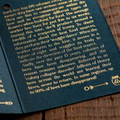
PRODUCTION / REALIZATION TECHNOLOGY: The label is enhanced by multi-level debossing and die-cut in a specific shape. The matte silkscreen and clear gloss foil elements on the label were chosen to speak to an upgraded experience and they provide contrast on the darker green background. Packaging also includes double-sided folded hangtag with a description of the product, which is printed on same, but thicker dark green uncoated premium paper.This sample perfectly illustrates that even products, that are released in small batches, can be packaged in good designed package, which is produced by using really high-quality materials. SPECIFICATIONS / TECHNICAL PROPERTIES: 380 ml glass jar The label is enhanced by multi-level debossing and die-cut in a specific shape. The matte silkscreen and clear gloss foil elements on the label were chosen to speak to an upgraded experience and they provide contrast on the darker green background. Packaging also includes double-sided folded hangtag with a description of the product, which is printed on same, but thicker dark green uncoated premium paper. TAGS: luxury, inspiration, fascination, exclusive, unique, creativity, brand architecture RESEARCH ABSTRACT: By incorporating natural materials, the design of the wooden lid reflects honesty of the raw honey. The wooden lid echoes the other design elements which represent purity, natural harmony, and authenticity,values are which are the values of the beekeepers as well as our design team. CHALLENGE: Creative Trade Mark's ambition was to create product labeling and packaging for The Botanic raw honey that would reflect the purity and natural integrity of the product. Starting with a product that is all natural, our challenge was to create design concepts that speak to the consumer about the original experience of the healthy and sweet, natural product inside each jar. ADDED DATE: 2019-09-18 18:03:35 TEAM MEMBERS (6) : Product design :Creative Trade Mark , Author: Zanas Karenauskas, Labels producer : Elegant Press, Wooden lid produced by Evaldas Usoris, Photo credit: Produck Mindaugas Norkaitis and IMAGE CREDITS: Photo: Produck, MIndaugas Norkaitis |
||||
| Visit the following page to learn more: https://bit.ly/34bnGrR | |||||
| AWARD DETAILS | |
 |
Creative Trade Mark Raw Honey by Zanas Karenauskas is Winner in Packaging Design Category, 2019 - 2020.· Press Members: Login or Register to request an exclusive interview with Zanas Karenauskas. · Click here to register inorder to view the profile and other works by Zanas Karenauskas. |
| SOCIAL |
| + Add to Likes / Favorites | Send to My Email | Comment | Testimonials | View Press-Release | Press Kit |

