Borboleta Brand System by Juan Eugenio Mallo Camera |
Home > Winners > #91454 |
 |
|
||||
| DESIGN DETAILS | |||||
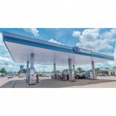
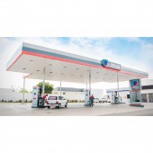
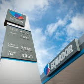
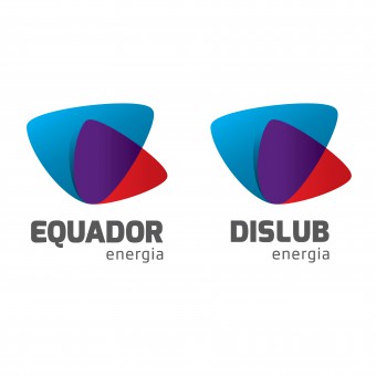
| DESIGN NAME: Borboleta PRIMARY FUNCTION: Brand System INSPIRATION: The main concept were: union, rebirth, transformation and modernism. The design team took the image of a butterfly that universally represents a symbol of powerful transformation, change, hope and renewal. The isotype is common to both brands and shows three significant colors, two representing the companies and the third representing the future. UNIQUE PROPERTIES / PROJECT DESCRIPTION: The design team achieved the goal of develop a new brand for two different companies that belonged to the same owner group. Dislub and Equador are gas station nets that operates in Northeast and North of Brasil respectively; working independently one respect of the other, and from now on they'll show the same image but mantaining his own name. That was the design challege: to give one logo for two related, but at the same time independent and completely different brands; using color, shapes and same graphic structure to get the work done. OPERATION / FLOW / INTERACTION: By sharing both companies the same symbol a clear link will make the client's mind connect both companies as one. PROJECT DURATION AND LOCATION: The design team began working in the second quarter of 2017 and the complete project was finished and approved to Dislub Equador Board of Directors in December of the same year. During the first quarter of 2018 the design team continued working with all the applications of the new brand. FITS BEST INTO CATEGORY: Graphics, Illustration and Visual Communication Design |
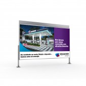
PRODUCTION / REALIZATION TECHNOLOGY: The design team constructed the logo with a module-based grid that allowed us to obtain a smooth and well-shaped design. SPECIFICATIONS / TECHNICAL PROPERTIES: (Standing Billboard - Structure) Width 7300mm x Height 5300mm (Ad Display) Width 6850mm x Height 3950mm TAGS: Logo, Branding, Brazil, Butterfly, Borboleta, Identity, Corporate, Symbol RESEARCH ABSTRACT: The isotype, the more characteristic element of the logo, represents a butterfly: a symbol strongly associated with nature, but also express a certain degree of Brazilian national spirit, therefore, the isotype also resembles the silouhette of the Brazilian territory. In addition the design team choose an unique color, purple, that represents the union of the two companies and sets them apart from the competitors in gas station market. CHALLENGE: The design team faced the challenge of representing two different brands with the same image but keeping both individualities, and instructed to present a well-adjusted solution for both brands with neither one being more important than the other. The team had to honor the previous colors so they identified the most representative one for each brand and added a third one to symbolize the union of both companies. ADDED DATE: 2019-09-13 18:50:40 TEAM MEMBERS (2) : Juan Eugenio Mallo Camera and Diego Adrián Beas IMAGE CREDITS: Juan Eugenio Mallo Camera, 2019. |
||||
| Visit the following page to learn more: http://equadorenergia.com.br/ | |||||
| AWARD DETAILS | |
 |
Borboleta Brand System by Juan Eugenio Mallo Camera is Winner in Graphics, Illustration and Visual Communication Design Category, 2019 - 2020.· Press Members: Login or Register to request an exclusive interview with Juan Eugenio Mallo Camera. · Click here to register inorder to view the profile and other works by Juan Eugenio Mallo Camera. |
| SOCIAL |
| + Add to Likes / Favorites | Send to My Email | Comment | Testimonials | View Press-Release | Press Kit |

