Rebirth Office by Shih Chieh Kao |
Home > Winners > #91277 |
 |
|
||||
| DESIGN DETAILS | |||||
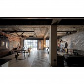
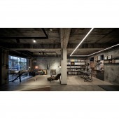
| DESIGN NAME: Rebirth PRIMARY FUNCTION: Office INSPIRATION: The designer wants to keep the primitive ambiance of the indoor space and makes it into a studio. Dismantle all the walls and bare the basic structure of concrete and brick walls naturally. The embellishment of iron pieces, old things, dried flowers, and plants brings the boundless vitality. Some plants are grown in the seams of the walls, which has the spirit of returning to the nature and the metaphor for rebirth. UNIQUE PROPERTIES / PROJECT DESCRIPTION: The forty years old warehouse is located on the first floor in a narrow lane. In the environment affected by orographical rain for years, it has the serious problem of wall mold. The designer dismantled interior walls to keep the brick walls and concrete plywood without additional decoration to allow more ventilation and adjust moisture. Carpentry is rarely used in the space. Instead, a large quantity of glass and iron pieces can be easily removed, recycled, reused to reduce pollution. OPERATION / FLOW / INTERACTION: Glass is used to replace partition to prevent the distance between indoors and outdoors, and attract the passersby who may feel curious about the activities in the space. A corridor paved with the irregular wood pattern tiles connects the fields in the space. The most primitive look of the construction is kept. The arrangement of old things and antique furniture brings about a vintage style. The materials exhibition area is planned beside the window. In the experimental space, the owner will be able to imagine the details and feelings of the future house through the colors and textures. PROJECT DURATION AND LOCATION: The project started in Sep. 2018 and finished in Mar. 2019 in Taipei, Taiwan. FITS BEST INTO CATEGORY: Interior Space and Exhibition Design |
PRODUCTION / REALIZATION TECHNOLOGY: The entrance is built with glass and iron pieces to visually extend the outdoor and indoor space. The ceiling molding is dismantled to expose the track lights. The right side of the front field is reception. The fragmented red brick walls are preserved, and a large wood table is placed casually. On the left side, the open space displays some old things or the collected antique furniture. The back field is the office. The LED lights compose the major lighting. The custom made iron book shelves are accompanied by a ladder to create the European attic style. The concept of the green wall makes the space full of the natural vitality. SPECIFICATIONS / TECHNICAL PROPERTIES: - TAGS: Interior, Design, House, Residence, Interior, Design, commercial space, Loft style RESEARCH ABSTRACT: The glass door introduces the outdoor light to upgrade the indoor brightness. The wall surface is dismantled to keep the brick walls and concrete plywood without additional decoration to allow more ventilation, adjust moisture, and solve the problem of wall mold. Carpentry is rarely used. Instead, a large quantity of glass and iron pieces can be easily removed, recycled, and reused. The floor tiles in the toilet are preserved for the dogs while most of the public area is paved with the wood floor, which effectively defines the area for the pets to relieve themselves and maintain the cleanness. The challenge is how to balance the visual beauty through the detailed embellishment after natural baring the basic structure of the concrete and brick wall without making the space look shabby and old. CHALLENGE: None ADDED DATE: 2019-09-10 07:15:42 TEAM MEMBERS (1) : IMAGE CREDITS: Shih Chieh Kao, 2019. |
||||
| Visit the following page to learn more: https://reurl.cc/EK26yn | |||||
| AWARD DETAILS | |
 |
Rebirth Office by Shih Chieh Kao is Winner in Interior Space and Exhibition Design Category, 2019 - 2020.· Press Members: Login or Register to request an exclusive interview with Shih Chieh Kao. · Click here to register inorder to view the profile and other works by Shih Chieh Kao. |
| SOCIAL |
| + Add to Likes / Favorites | Send to My Email | Comment | Testimonials | View Press-Release | Press Kit |


