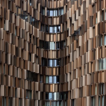
U15 Photographic Series by Tiago Marques |
Home > Winners > #90822 |
 |
|
||||
| DESIGN DETAILS | |||||
| DESIGN NAME: U15 PRIMARY FUNCTION: Photographic Series INSPIRATION: The building U15, subject of Tiago and Tania's photographic series, is located in a part of the new district of north Milanofiori, in Milano. Designed by Cino Zucchi Architetti, the structure is in a continuing relationship with the design of the green. The artists inspired by the masterplan idea, take advantage of the shapes, colors, and materials of U15, to develop a photographic concept which wants to combine the building design with traditional nature landscapes. UNIQUE PROPERTIES / PROJECT DESCRIPTION: The project aims to evoke, from the artists' architecture photographs, elements present in nature. That photographs exploit the U15's aseptic shapes in a sharp relationship with landscape stereotypes present in our subconscious, like waterfalls, mountains, waves, and more. U15 is a photographic series that links two contrasting realities, generating a new vision of the building. Every single frame conveys two different interpretations. OPERATION / FLOW / INTERACTION: Working on U15, the artists obtained a lot of different shots, which caused a long selection process. The hardest part was to find photographs that could best fit the idea. They made several pools online to individuate the most intuitive association. To realize this photographic series, they plan to use the lambda chromogenic print technology, keeping a faithful representation of the U15's metallic tones and utilize the same building's materials to frame the prints. PROJECT DURATION AND LOCATION: The project started on the 14th of April 2018 in Milanofiori. It requested several months of work, including a first selection, associations with natural landscapes, online pools, post-production, the second round of online pools, final selection, and release on our website. FITS BEST INTO CATEGORY: Photography and Photo Manipulation Design |
PRODUCTION / REALIZATION TECHNOLOGY: In this photographic series, they had intentionally overexposed the sky, to focus the attention entirely on the structure and its features. The artists preferred to work during the afternoon, with the highest luminosity, to perform in freehand take advantage of more dynamic frames, keeping a minimalist approach. SPECIFICATIONS / TECHNICAL PROPERTIES: To achieve the highest dynamic range possible, they opted to work in RAW format. Thanks to that, during the post-production, Tiago and Tania were able to handle shadows, highlights, and sporadic reflections, keeping a well-balanced contrast, without a more invasive file manipulation. TAGS: architecture, architectural photography, photography, cityscape, building, milano, italy, milan, design, futuristic, minimal, minimalism, metal, material, nature, natural, environment, ambient, waterfall, rocky slope, waves, mountains, cortex, relationship, trees, U15 RESEARCH ABSTRACT: To find the right photographs for the project, Tiago and Tania had created a lot of calls to actions in the social networks. The massive reaction of people helped to define that selection. From the 13.459 interactions, 64% of them came from a target with an age of mid 18 and 35 years old. The results were mostly in accord with the artists' proposals. They also noticed that most of the suggestions to change the comparison came from accounts under 30. CHALLENGE: The major challenge was to show the building from several angles. The pictures should have suggested multiple interpretations. To did it, the artists took several shots, trying to forecast the final result. It was a goal hard to reach because they had to keep focused on the collective imaginary of nature during all the creative processes. ADDED DATE: 2019-08-31 17:20:26 TEAM MEMBERS (2) : Tiago Marques and Tania De Pascalis IMAGE CREDITS: Main image: Photographer, Tania De Pascalis, Waterfall 2018 Image #1: Photographer, Tiago Marques, Mountains 2018 Image #2: Photographer, Tania De Pascalis, Cortex 2018 Image #3: Photographer, Tiago Marques, Waves 2018 Image #4: Photographer, Tiago Marques, Rocky slope 2018 |
||||
| Visit the following page to learn more: http://bit.ly/37gHIRW | |||||
| AWARD DETAILS | |
 |
U15 Photographic Series by Tiago Marques is Winner in Photography and Photo Manipulation Design Category, 2019 - 2020.· Press Members: Login or Register to request an exclusive interview with Tiago Marques. · Click here to register inorder to view the profile and other works by Tiago Marques. |
| SOCIAL |
| + Add to Likes / Favorites | Send to My Email | Comment | Testimonials | View Press-Release | Press Kit | Translations |


