Cafe Tunico Brand Design by Mateus Matos Montenegro |
Home > Winners > #89224 |
 |
|
||||
| DESIGN DETAILS | |||||
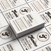
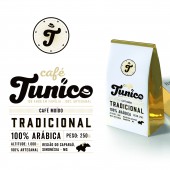
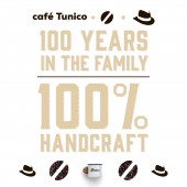
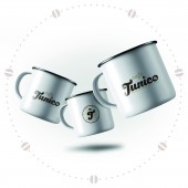
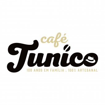
| DESIGN NAME: Cafe Tunico PRIMARY FUNCTION: Brand Design INSPIRATION: The inspiration for this project came from family history and its intrinsic relationship with coffee. Mr. Tunico's grandparents planted the seed that gave rise to the love of coffee. Generations of their families are fruits of this passion. It was with all this love and affection that, after 100 years of hard work and experience, decided to bring the family coffee to all Brazilians. A coffee made by those who are proud to do what they love. 100 years of family, 100% artisan coffee. UNIQUE PROPERTIES / PROJECT DESCRIPTION: Gratitude germinated in the heart of the family. Even after Seu Tunico, the patriarch, divided his land among his seven sons, they remained there, their feet planted and engaged in the care of the land that helped raise them. Moreover, it is with all this love and affection that, after 100 years of hard work and experience, they have decided to take the coffee they plant directly to the table of other families, with the brand that translates their story. A coffee made by those who are proud to do what they love. Coffee, family, 7 children and Mr. Tunico Lucas. These are the pillars of this story, and that's what the logo translated into. The coffee design discreetly replaces point i. The inseparable companion hat represents Mr. Tunico. Typography represents the whole family tradition and the artisanal method of coffee production. A seal is a way of identifying the brand quickly and can be applied to various places and objects. In it we use the T, initial letter of Tunico, with his hat, which always accompanies him, and the grains around, representing the 7 children to whom he passed the legacy of his lands and crops. OPERATION / FLOW / INTERACTION: The brand have a design that brings tradition of the family in its core, but imposes itself as a modern and current brand, Because of it, it attracts the target audience, as well as establishing itself as a brand of quality and strong in the acting market, with fantastic results in a very short time. PROJECT DURATION AND LOCATION: February 2018 to may 2019 FITS BEST INTO CATEGORY: Graphics, Illustration and Visual Communication Design |
PRODUCTION / REALIZATION TECHNOLOGY: For the Cafe Tunico brand project, were used a variety of materials in the applied parts. Packaging with aluminum inner lining and screen printing in CMYK and a golden Pantone. Special business cards for sellers with printed price lists, billboards and banners. Special packaging is being developed for the brand's premium version on kraft paper with silkscreen, vinyl sticker and a special seal on hot wax. It was created and produced a film for online placement on social media, filmed on the farm and with Mr. Tunico and his wife. SPECIFICATIONS / TECHNICAL PROPERTIES: The packages are filled with roasted coffee and coffee beans, ranging from 250g, 500g and 1kg each. The business cards have standard measures of 5cm x 9cm closed, with a fold. An institutional film was created for the brand with placement in social media in FullHD. TAGS: Brand, logotype, coffee, design, packaging, brazil, arabia, handcraft, craft, family made, 100%, 100 years, handmade RESEARCH ABSTRACT: A market research was done to diagnose the most common and generic design styles so that the brand could differentiate itself in a strong and coherent way. CHALLENGE: The roots of the family were built through the coffee. As a child, Mr. Tunico dealt with the planting. Time passed, the family growing, and the coffee was still there, firm and strong. It is more than a seed, it is the translation of all this union. And now, the coffee will not only be produced there, it will be packed and will come to the table of other families. So bringing all these references was our biggest challenge. ADDED DATE: 2019-07-02 19:36:14 TEAM MEMBERS (2) : and IMAGE CREDITS: Image credits to Mateus Matos Montenegro and Avalanche Vitória. Video credits to Mateus Matos Montenegro and Avalanche Vitória. |
||||
| Visit the following page to learn more: http://cafetunico.com.br/ | |||||
| AWARD DETAILS | |
 |
Cafe Tunico Brand Design by Mateus Matos Montenegro is Winner in Graphics, Illustration and Visual Communication Design Category, 2019 - 2020.· Read the interview with designer Mateus Matos Montenegro for design Cafe Tunico here.· Press Members: Login or Register to request an exclusive interview with Mateus Matos Montenegro. · Click here to register inorder to view the profile and other works by Mateus Matos Montenegro. |
| SOCIAL |
| + Add to Likes / Favorites | Send to My Email | Comment | Testimonials | View Press-Release | Press Kit | Translations |
Did you like Mateus Matos Montenegro's Graphic Design?
You will most likely enjoy other award winning graphic design as well.
Click here to view more Award Winning Graphic Design.


