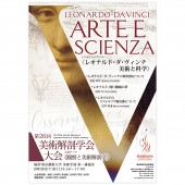
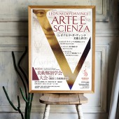
JSAA 2019 Poster Public Relations Activities by Naoyuki Fukumoto |
Home > |
| CLIENT/STUDIO/BRAND DETAILS | |
 |
NAME: Japanese Society of Artistic Anatomy PROFILE: The Japanese Society of Artistic Anatomy was founded in July 1994 at the Department of Artistic Anatomy, Faculty of Fine Arts, Tokyo University of the Arts, as a place for younger researchers to develop their interests and studies of art and anatomy. The aim of the society is to bring together researchers in the fields of art and anatomical science for the purposes of interacting through art per se and research in the fine arts and anatomical studies, and of developing theoretical and practical foundations for research into the human figure and its inherent beauty. The society annually publishes “The Journal of Artistic Anatomy” which was started as an outlet for members to present their research. The journal through the editorial board aims to reflect future developments and directions of artistic anatomical studies. The society also annually organizes a variety of events for members, including lectures, meetings and general conferences. The conferences provide a venue for members to present their research, exchange information, discuss mutual interests and develop collaborative research activities. The society provides a network for members and is open to researchers in fields related to practical and theoretical studies of art, and basic and applied anatomical sciences. The administrative office of the society is housed in Department of Artistic Anatomy II, the Graduate School of Fine Arts, Tokyo University of Arts. |
| AWARD DETAILS | |
 |
Jsaa 2019 Poster Public Relations Activities by Naoyuki Fukumoto is Runner-up for A' Design Award in Graphics, Illustration and Visual Communication Design Category, 2019 - 2020.· Press Members: Login or Register to request an exclusive interview with Naoyuki Fukumoto. · Click here to register inorder to view the profile and other works by Naoyuki Fukumoto. |
| SOCIAL |
| + Add to Likes / Favorites | Send to My Email | Comment | Testimonials |


