Event Visual Identity by Shimizu Ryo |
Home > Winners > #88556 |
 |
|
||||
| DESIGN DETAILS | |||||
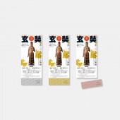
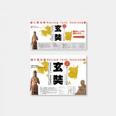
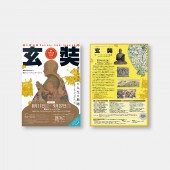
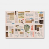
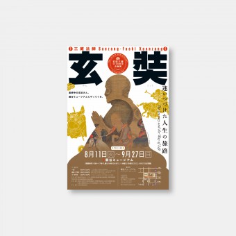
| DESIGN NAME: Event PRIMARY FUNCTION: Visual Identity INSPIRATION: Based on the story about Xuan (Sanzo Hoshi), we made my first image grow. In addition, we have interviewed a huge amount of materials related to him and the image that the exhibition aims for. We also grasped the space of the venue in advance and made an alignment with the visuals. UNIQUE PROPERTIES / PROJECT DESCRIPTION: An exhibition that takes up a popular character called Sanzo Hoshi from a completely different perspective. Therefore, We tried a new approach to visual design. It has a three-dimensional composition with a depth that makes the painting hollow with the silhouette of a person. OPERATION / FLOW / INTERACTION: I iconified the silhouette of the ginseng and arranged the same illustration as the taste. Aiming for visual appeal with titles and icons PROJECT DURATION AND LOCATION: The project started in October 2014 and finished August 2015. FITS BEST INTO CATEGORY: Graphics, Illustration and Visual Communication Design |
PRODUCTION / REALIZATION TECHNOLOGY: By widely placing the name Xuan, we aimed to appeal the exhibition title. In addition, the color design was adjusted to the taste of the exhibit, and the design was integrated including the venue. SPECIFICATIONS / TECHNICAL PROPERTIES: While appealing that Xuanzui and Sanzo Hoshi are the same people, We made a strategy to have the silhouette remember the iconic image. TAGS: japanese graphic design, editorial design, exhibition, visual Identity, illustration, RESEARCH ABSTRACT: Based on the story about Xuan, we made my first image grow. In addition, we have interviewed a huge amount of materials related to him and the image that the exhibition aims for. We also grasped the space of the venue in advance and made an alignment with the visuals. CHALLENGE: I iconified the silhouette of the ginseng and arranged the same illustration as the taste. ADDED DATE: 2019-06-28 05:55:17 TEAM MEMBERS (1) : SHIMIZU Ryo IMAGE CREDITS: Photo: SHIMIZU Ryo |
||||
| Visit the following page to learn more: http://lloon.jp/ | |||||
| AWARD DETAILS | |
 |
Event Visual Identity by Shimizu Ryo is Winner in Graphics, Illustration and Visual Communication Design Category, 2019 - 2020.· Read the interview with designer Shimizu Ryo for design Event here.· Press Members: Login or Register to request an exclusive interview with Shimizu Ryo. · Click here to register inorder to view the profile and other works by Shimizu Ryo. |
| SOCIAL |
| + Add to Likes / Favorites | Send to My Email | Comment | Testimonials | View Press-Release | Press Kit | Translations |
Did you like Shimizu Ryo's Graphic Design?
You will most likely enjoy other award winning graphic design as well.
Click here to view more Award Winning Graphic Design.


