Ten Posters by Kalyani Kamat Bambolkar and Ling Lee |
Home > Winners > #88519 |
 |
|
||||
| DESIGN DETAILS | |||||
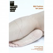
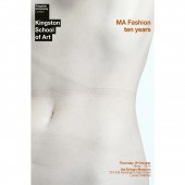
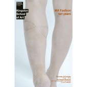
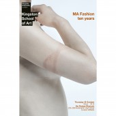
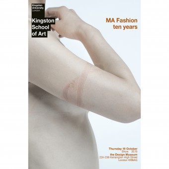
| DESIGN NAME: Ten PRIMARY FUNCTION: Posters INSPIRATION: A fashion event was hosted by Kingston University in the month of October to celebrate the tenth anniversary of their MA Fashion course. 10 fashion students were selected to showcase their works. The repetition of ’10’ initiated the concept of using ‘X’ as an identity for this event. The brief was to design posters without showing the actual student’s work and typical fashion elements. This led to an idea of showing marks left by these designer clothes on one’s body in the shape of ‘X’ to symbolize this event. UNIQUE PROPERTIES / PROJECT DESCRIPTION: Kingston University completed 10 years of its MA fashion course, so they decided to showcase their student's finest works at The Design Museum, London. The brief was to design posters without showing the actual student’s work and typical fashion elements. The posters were designed by showing marks of clothes on one’s body in the shape of ‘X. These posters were displayed all around the event and further used in other design elements, such as E-invites, brochures, stage slideshow etc. OPERATION / FLOW / INTERACTION: The posters were designed for the audience to get excited about the fashion show. As the images on the posters did not reveal the work of the students in any way, it created curiosity about the event. PROJECT DURATION AND LOCATION: The project started at the end of September 2017 and finished in October 2017 in London, UK. FITS BEST INTO CATEGORY: Graphics, Illustration and Visual Communication Design |
PRODUCTION / REALIZATION TECHNOLOGY: The posters were a culmination of both photography and graphic design. After the photoshoot, the raw images were enhanced in Adobe Photoshop and designed filling in the details about the event date, time and venue. The photos were also used for E-invites and brochures. The E-invites were sent out a week before the event so that the guests could RSVP. The brochures had details and schedule of the event and contact information about each of the fashion students that participated.The photos were also used for E-invites and brochures. The E-invites were sent out a week before the event so that the guests could RSVP. The brochures had details and schedule of the event and contact information about each of the fashion students that participated. SPECIFICATIONS / TECHNICAL PROPERTIES: Brochures were printed out in 297 x 420 mm and folded into half. Posters were printed out in 841 x 1189mm. TAGS: poster, design, fashion, visual communication, fashion show, art, brochure, E-invite RESEARCH ABSTRACT: A fashion event was hosted by Kingston University in the month of October to celebrate the tenth anniversary of their MA Fashion course. 10 fashion students were selected to showcase their works. The brief was to design posters without showing the actual student’s work and typical fashion elements. The repetition of ’10’ initiated the concept of using ‘X’ as an identity for this event. Initial concepts consisted of graphics created around ‘X’. However, this was not approved by the fashion department’s leadership, as according to them, the graphical posters did not reflect fashion. Interestingly they did like the concept of using ‘X’ as a part of branding. After having experimented with few concepts, a thought came about representing fashion as people instead of clothes. To accomplish this, an idea of showing marks left on one's body in the form of ‘X' by these designer clothes was finalised. A photo shoot was done and marks were created with the help of ribbons, clothes and rope. The photos were then integrated into posters, brochures and E-invites. CHALLENGE: The marks were created with the help of ribbons, clothes and rope. But, the marks were quickly fading away and not visible in the shots. The struggle was to make the shots quick and clear. ADDED DATE: 2019-06-27 19:25:54 TEAM MEMBERS (2) : Designer: Kalyani Kamat Bambolkar and Designer: Ling Lee IMAGE CREDITS: All Photo credits: Kalyani Kamat Bambolkar PATENTS/COPYRIGHTS: The posters and images are owned by Kingston University. |
||||
| Visit the following page to learn more: https://www.kingston.ac.uk/news/article/ |
|||||
| AWARD DETAILS | |
 |
Ten Posters by Kalyani Kamat Bambolkar and Ling Lee is Winner in Graphics, Illustration and Visual Communication Design Category, 2019 - 2020.· Press Members: Login or Register to request an exclusive interview with Kalyani Kamat Bambolkar and Ling Lee. · Click here to register inorder to view the profile and other works by Kalyani Kamat Bambolkar and Ling Lee. |
| SOCIAL |
| + Add to Likes / Favorites | Send to My Email | Comment | Testimonials | View Press-Release | Press Kit | Translations |

