Family Cohesion Residential Space by Kai-Chun Ma |
Home > Winners > #88490 |
 |
|
||||
| DESIGN DETAILS | |||||
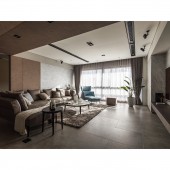
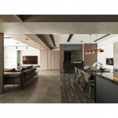
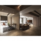
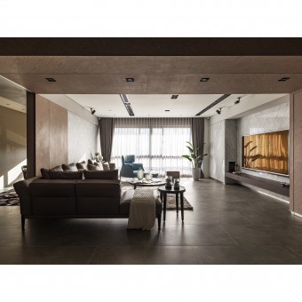
| DESIGN NAME: Family Cohesion PRIMARY FUNCTION: Residential Space INSPIRATION: The perfect artistic model can intrigue life with profound ideas, context and sensation that blend in urban views or natural environment to break away from traditional function based building and space. Such model satisfies the vision so that the concept of aesthetics extends outside in as the most direct mean to approach art. UNIQUE PROPERTIES / PROJECT DESCRIPTION: This parent-children unit is designed for young couples with newborns. The black and grey lines and furnishing depict the spatial expression of 80 percent modern neatness and 20 percent coziness. The arrangement of large area accomplishes the casual and stress-relief effect. The living room is the center and extended to other areas. The design intrigues the owner to re-examine his focus of life and warms up the exchange temperature with family, using natural, simple and stress-free space to comfort the soul and the time spending with family. OPERATION / FLOW / INTERACTION: The linear elements extends the syntax of public and private areas, quoting the graceful taste without excessive installation or decoration, to minimize the spatial colors and respond the health appeal by parents and children for the living environment through eco-friendly green materials. The movement stresses the intimate interaction between areas and provides considerable tranquility and comfort. PROJECT DURATION AND LOCATION: The project started in April 2018 and finished in December 2018 in Taipei city, Taiwan. FITS BEST INTO CATEGORY: Interior Space and Exhibition Design |
PRODUCTION / REALIZATION TECHNOLOGY: All materials are non-toxic and eco-friendly when giving consideration for providing children with a healthy living space without pressure. For example, the special paint imported from Italy, stucco and diatomaceous earth are used. The different level of brightness and temperature highlight the internal emotion for home. The living room area composes the living requirement using simple functional objects to guide through the open movement through the position of furniture. SPECIFICATIONS / TECHNICAL PROPERTIES: The indoor area is approximately 191 square feet. TAGS: spatial transparency, green materials, line and dimension, open space design RESEARCH ABSTRACT: The hallway extends spatial transparency and visual interaction using grey glass, where a display cabinet is designed to store collection with the implication of greeting the guests. The beams serves as the center of space, as the wall, ceiling and study room reflect the image of simplicity. The beam also indirectly balances and softens the space by introducing peoples touch, which derives the cozy longing for freedom. The top of the dining and kitchen area is shaped in a trapezoid to weaken the perception of compression and introduces the rhythm of lighting and shadow by layers through the light strip and patterned stucco. CHALLENGE: Appealing in lifestyle and promoting parent-children exchange through peoples memory, the design skillfully applies visual extension, crisscross and blending in response to the living movement of dwellers and maintain the perfect flexibility. The color of material is taken into consideration to provide a relaxing and tranquil image of tolerance, which coheres some mesmerizing power through the tension of natural stone pattern and the layers of indirect lighting. ADDED DATE: 2019-06-27 15:17:59 TEAM MEMBERS (1) : IMAGE CREDITS: Kai-Chun Ma, 2019. |
||||
| Visit the following page to learn more: http://bit.ly/2wNQav8 | |||||
| AWARD DETAILS | |
 |
Family Cohesion Residential Space by Kai-Chun Ma is Winner in Interior Space and Exhibition Design Category, 2019 - 2020.· Read the interview with designer Kai-Chun Ma for design Family Cohesion here.· Press Members: Login or Register to request an exclusive interview with Kai-Chun Ma. · Click here to register inorder to view the profile and other works by Kai-Chun Ma. |
| SOCIAL |
| + Add to Likes / Favorites | Send to My Email | Comment | Testimonials | View Press-Release | Press Kit |
Did you like Kai-Chun Ma's Interior Design?
You will most likely enjoy other award winning interior design as well.
Click here to view more Award Winning Interior Design.


