East Side Italian Craft Beer by Roberto Terrinoni |
Home > Winners > #88185 |
 |
|
||||
| DESIGN DETAILS | |||||
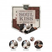
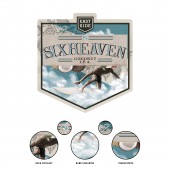
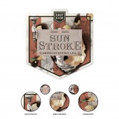
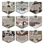
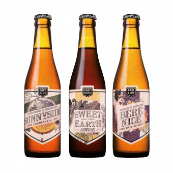
| DESIGN NAME: East Side PRIMARY FUNCTION: Italian Craft Beer INSPIRATION: Each label tells a story. This story is made of flavors, legends, qualities, references and ideas that complete the experience of tasting these ice-cold beers. A very complex visual architecture alternates elements that tell the story of the product (the photographic parts in collage style, the colors and the heraldic pictogram) to others that underline the brand identity (the setting, typography and frequent use of the basic form of the brand). UNIQUE PROPERTIES / PROJECT DESCRIPTION: As well as being elegant and versatile, the collage technique allows to insert some visual elements that highlight the identity of the product, such as references to the meaning of the name, to the beer typology and to its ingredients. The logo design, which represents the corporate identity, is based on a simple shape. This shape was reproduced on the die-cut of the labels and on the symbol system of every single beer using a customization which is both colourful and heraldic. OPERATION / FLOW / INTERACTION: This label tells a story that the master brewer Luciano Landolfi manages to express with every single beer; a tale of processes, ingredients and cultural roots. The real challenge was to convey all these concepts with a small label. PROJECT DURATION AND LOCATION: This project was born in 2015 in Latina, in Central Italy. A new brewery was starting to get attention and growing rapidly. A year after its foundation, it decided to reset the communication of the brand and restyle three labels from its selection of beers. The collaboration still goes on today and it has given birth to a range 22 labels; the goal is to reach 30 by the end of 2020. Today the brewery is considered a rising star in the Italian and international scene of craft beer. FITS BEST INTO CATEGORY: Graphics, Illustration and Visual Communication Design |
PRODUCTION / REALIZATION TECHNOLOGY: Paper, off-set print, screen printing polishing SPECIFICATIONS / TECHNICAL PROPERTIES: 8,5x9 cm TAGS: beer, collage, packaging, label, italy, RESEARCH ABSTRACT: At the dawn of the success of craft beer in Italy, the brief asked to approach the communicative tone of wine while maintaining some distinctive traits of beer. Being a product designed to be enjoyed at the table, it required the 75 cl format. The target had to be adjusted to the price of the craft, a much higher one compared to most industrial beers. The brand is ppredominant in the world of craft beers and it shows on the label, which is typical of an industrial beer, so to benefit the product and its identity. CHALLENGE: The main challenge was facing a very fresh market in Italy: there were no know-how, no rules, only intuitions. Mixing the results of market research conducted abroad with the forecasts of the Italian demand was the most challenging task. ADDED DATE: 2019-06-25 10:16:04 TEAM MEMBERS (1) : IMAGE CREDITS: video by east side brewing |
||||
| Visit the following page to learn more: https://robertoterrinoni.com/ | |||||
| AWARD DETAILS | |
 |
East Side Italian Craft Beer by Roberto Terrinoni is Winner in Packaging Design Category, 2019 - 2020.· Press Members: Login or Register to request an exclusive interview with Roberto Terrinoni. · Click here to register inorder to view the profile and other works by Roberto Terrinoni. |
| SOCIAL |
| + Add to Likes / Favorites | Send to My Email | Comment | Testimonials | View Press-Release | Press Kit | Translations |

