EXP Brasil Brand Brand Design by Mateus Matos Montenegro |
Home > Winners > #87730 |
 |
|
||||
| DESIGN DETAILS | |||||
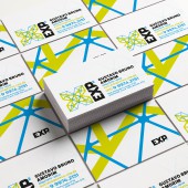
| DESIGN NAME: EXP Brasil Brand PRIMARY FUNCTION: Brand Design INSPIRATION: The brand has an immense importance for the business because it symbolizes a great everything of the company, its ideals, quality, concepts, designs, technology, its way of attending to the customer, its unique peculiarities. The EXP Brasil brand was born from these principles, appropriating the mixture between technology and design, and inserting this concept into the letter X, which has in itself the idea of the correct place, the point of the question and the answer. The use of the negative space was also included in the typography, to reaffirm the studio concept and position. UNIQUE PROPERTIES / PROJECT DESCRIPTION: The proposal appropriates the elements of unity, partnership, robustness, lightness and technology that are as much used in the projects as in the office structure, and in its various areas of expertise within Architecture, Urbanism and Engineering. The union is the strength of this company. The union between people and forms; individual and collective; simple with technological; lightweight and robust; professional and personal. To unify all these elements, it was used an element of the source design in an integrated and solid way. In the typography, the special design of the letter E uses the negative space to create with the letter X a house icon, reinforcing the commitment of the studio. The letter P has the lower part in a curve, relating with the design of an open door in a blueprint. OPERATION / FLOW / INTERACTION: The brand interacts with its medium, whether it is paper, business card, outdoor signs or billboards. Exactly representing all this union and interaction between its employees and their areas of expertise within Architecture and Engineering. The negative space in the typography interacts with the product, a building, a house, a construction. PROJECT DURATION AND LOCATION: The project started February 2018 and ended in January 2019 FITS BEST INTO CATEGORY: Graphics, Illustration and Visual Communication Design |
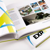
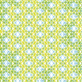
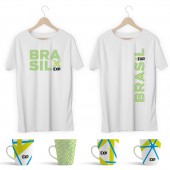
PRODUCTION / REALIZATION TECHNOLOGY: Many elements have been created to complement the brand. From business cards, Billboard for the contruction site, printed portfolio, design patterns, social media, t-shirts and coffee mugs. Each one with its technology, from offset printing, screen printing and acrylic UV printing. SPECIFICATIONS / TECHNICAL PROPERTIES: The design was designed in CMYK, making it easy to print on a variety of media, but always thinking about RGB space and how shapes and colors would fit in the middle of the light. TAGS: Architecture, brand, logotype, engineering, contruction, design RESEARCH ABSTRACT: Research was done in various areas related to architecture and engineering, from magazines, visits to works in progress and completed, and one day analyzing the structure and how the company works internally with its employees. CHALLENGE: The great creative challenge was to bring and express all the union, quantity, malleability and quality of the functions and areas that the company provides. Putting it all together into one symbol, in the positive and negative space, that represented the soul of the company. ADDED DATE: 2019-06-21 14:00:47 TEAM MEMBERS (1) : Mateus Matos Montenegro IMAGE CREDITS: Mateus Matos Montenegro, 2019. |
||||
| Visit the following page to learn more: http://expbrasil.com/ | |||||
| AWARD DETAILS | |
 |
Exp Brasil Brand Brand Design by Mateus Matos Montenegro is Winner in Graphics, Illustration and Visual Communication Design Category, 2019 - 2020.· Press Members: Login or Register to request an exclusive interview with Mateus Matos Montenegro. · Click here to register inorder to view the profile and other works by Mateus Matos Montenegro. |
| SOCIAL |
| + Add to Likes / Favorites | Send to My Email | Comment | Testimonials | View Press-Release | Press Kit | Translations |

