Peace and Presence Well-Being Branding by Lisa Winstanley |
Home > Winners > #87317 |
 |
|
||||
| DESIGN DETAILS | |||||
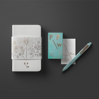
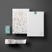
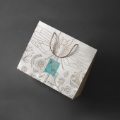
| DESIGN NAME: Peace and Presence Well-Being PRIMARY FUNCTION: Branding INSPIRATION: The desire to invoke a peaceful, calming and relaxing state for customers was expressed. With this in mind the creative team tried to discover what it was that personally induced that state in the owners of P&PW. Childhood memories were discussed; playing in the woods by a stream, memories of nature and the flora and fauna by the riverbank. Nature and water were key reference points as was a nostalgic fondness of times gone by. This emotive response is amplified in the brand aesthetic UNIQUE PROPERTIES / PROJECT DESCRIPTION: Peace and Presence Wellbeing Is a UK based holistic therapy brand providing services such as reflexology, holistic massage and reiki to rejuvenate the body, mind and spirit. The P&PW philosophy is to help clients to find a state of stillness with an insight into inner peace by paying attention to what is now with a kind heart. Let go... be open to pure relaxation, comfort and bliss. OPERATION / FLOW / INTERACTION: The client was keen to ensure that the branding was appealing to a high end clientele and that their customers would be keen to purchase and use brand merchandise including tote bags, note pads and select beauty products such as massage oil, body lotion and skin care. The client intended this as a secondary advertising mechanism. PROJECT DURATION AND LOCATION: The project Started in December 2018 and finished in June 2019 in Singapore and UK FITS BEST INTO CATEGORY: Graphics, Illustration and Visual Communication Design |
PRODUCTION / REALIZATION TECHNOLOGY: Brand logo is printed using a copper foil wherever possible. Alternatively a Pantone 876 metallic copper spot colour is used Stationery printed on a textured matte recycled stock. The design was created by focussing on a human centric approach. The client was involved at all stages and it was through in-depth personal interviews that the visual language was developed. SPECIFICATIONS / TECHNICAL PROPERTIES: Business card 90mm x 55mm Letterhead 210mm x297mm Printed using metallic copper foil on textured matte recycled stock TAGS: branding, visual identity, logo, stationery, packaging, merchandise RESEARCH ABSTRACT: After initial consultation mindmaps and moodboards were created, leveraging on the themes of water and nature and attempting to find a delicate, calming, almost nostalgic aesthetic. Copper tones, both in its natural and oxidised state, were inspired by ageing garden water fountains and the flora and fauna of woodland streams inspired the illustrative aspect of the brand. A clean and minimal logotype was designed to reflect the desire to appeal to a high end clientele, yet this somewhat sharp minimalism was balanced and softened with natural textures and organic illustration. CHALLENGE: The resulting visual system for Peace and Presence Wellbeing was crafted from in-depth interviews with the client with a view to establishing key motivations behind the company and the key aims of the brand. These interviews provided insights which helped structure the aesthetics and underpin the visuals with the values of the company ADDED DATE: 2019-06-13 06:54:11 TEAM MEMBERS (1) : IMAGE CREDITS: Lisa Winstanley, 2019. |
||||
| Visit the following page to learn more: https://www.lisawinstanley.com | |||||
| AWARD DETAILS | |
 |
Peace and Presence Well-Being Branding by Lisa Winstanley is Winner in Graphics, Illustration and Visual Communication Design Category, 2019 - 2020.· Press Members: Login or Register to request an exclusive interview with Lisa Winstanley. · Click here to register inorder to view the profile and other works by Lisa Winstanley. |
| SOCIAL |
| + Add to Likes / Favorites | Send to My Email | Comment | Testimonials | View Press-Release | Press Kit | Translations |


