Yan Natural Juice Bottle Packaging by Backbone Branding |
Home > Winners > #86906 |
 |
|
||||
| DESIGN DETAILS | |||||
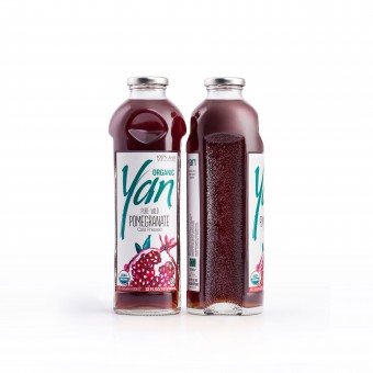
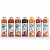
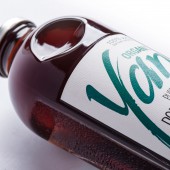
| DESIGN NAME: Yan Natural Juice PRIMARY FUNCTION: Bottle Packaging INSPIRATION: The inspiration lays in the analysis of the fruit eating habits of people either be it by slicing or biting the fruits. It was interesting to observe that the most attractive fruits are bitten impatiently and that people would take the second bite only if it tasted good. The shape and the pattern of a double bitten apple led us to experiment and develop different models of bottles. In this experiment we discovered that the bitten and the wholesome parts of apples complement each other just like Yin and Yang. UNIQUE PROPERTIES / PROJECT DESCRIPTION: The brand of the Yan Natural Juice revolves around the concept of Organic in Everything. Therefore the bottle was designed based on bio mimicry principles representing bitten apples put one after another which serve as a visual feature for the shape of the bottle. The arrangement of the bottles allows for a significant saving of the pace both on shelves and during transportation. Later on a new label for new organic juice line was designed, with a stylised calligraphic inscription of the name Yan as a thin grass reed reminding the nature. OPERATION / FLOW / INTERACTION: We observed how consumers hold the bottles while putting them in a refrigerator and taking them out. People would usually take them from the bottleneck or its cover. So we came up with a furrow shape solution for the upper part that made it comfortable for the fingers to hold the bottle. The shape has become so popular that people would describe the Yan juice bottle as the convenient bottle. PROJECT DURATION AND LOCATION: January to May 2017 in Yerevan Armenia FITS BEST INTO CATEGORY: Packaging Design |
PRODUCTION / REALIZATION TECHNOLOGY: A special furrow shape solution for the upper part of the bottle was designed for the most convenient customer experience. Another additional feature was an anti slip surface on both sides of the bottle which made it easy for people to pour from slippery bottles. The new technology of complementing bottles gives an opportunity for safer transportation compared with the regular cylindrical bottles that are more fragile. To emphasise the premium quality and the Eco consciousness of the product we have chosen recyclable glass as a perfect material for storing it. The paper of the label is also recyclable. SPECIFICATIONS / TECHNICAL PROPERTIES: Width 70mm x Depth 85mm x Height 265 mm TAGS: natural juice, packaging design, biomimicry, organic, RESEARCH ABSTRACT: Our conviction to bring fundamental design solutions was expressed in asking deep and difficult questions that would consider human needs and aspirations, while working to marry them with functionality. The research carried an observational nature as having identified the main philosophy of the bottle. We were still observing how people use bottles at home or in the office to make it as convenient for them as possible. Considering the Armenian society which is is centred around the values of family, we needed to create an emotional attachment to the product that every family would connect to. The result was a packaging with strong identity as well as functional solutions that were not even given by the client in the first place. CHALLENGE: Glass bottles aren’t easy to develop. Unlike the average cylindrical bottles with the perfect symmetry, these ones faced many problems in the manufacturing process. We calculated the perfect proportions, made it geometrically correct and yet different curves on the bottle came slightly uneven. The heat of autoclave sterilisation process would break the thinner parts of the glass. So the solution was to reduce the temperature in autoclave. It resulted in shortening the shelf life of the product but kept it more fresh. The challenge turned into an advantage which made the juice healthier and tastier, proper of a premium brand. ADDED DATE: 2019-05-17 08:37:47 TEAM MEMBERS (3) : Art Director & Designer: Stepan Azaryan, Illustrator: Armenak Grigoryan and Realization: Lilit Arshakyan IMAGE CREDITS: All photo credits to Backbone Branding |
||||
| Visit the following page to learn more: https://bit.ly/2W86XnQ | |||||
| AWARD DETAILS | |
 |
Yan Natural Juice Bottle Packaging by Backbone Branding is Winner in Packaging Design Category, 2019 - 2020.· Press Members: Login or Register to request an exclusive interview with Backbone Branding. · Click here to register inorder to view the profile and other works by Backbone Branding. |
| SOCIAL |
| + Add to Likes / Favorites | Send to My Email | Comment | Testimonials | View Press-Release | Press Kit | Translations |


