Tuborg, 50 Years in Turkey Beer Can by Christopher Colak - I Mean It |
Home > Winners > #85963 |
 |
|
||||
| DESIGN DETAILS | |||||
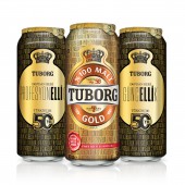
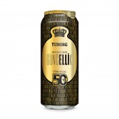
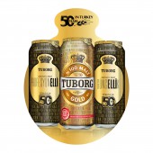
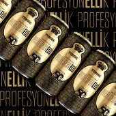
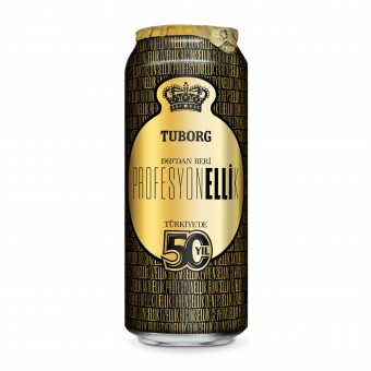
| DESIGN NAME: Tuborg, 50 Years in Turkey PRIMARY FUNCTION: Beer Can INSPIRATION: 2019 is Tuborg's 50 years anniversary in Turkey. We focused on the Tuborg's brand and production values. Our core idea was the name 'fifty' which is read as 'Elli' in Turkish. And we designed a typographic can design. We inspired by the other words that contains 'elli' such as deneysellik (means experimentality), entellektuellik (means intellectuality), aktuellik (means timeliness), guncellik (means up-to-dateness). We found out more than twenty words that relate with the brand image. UNIQUE PROPERTIES / PROJECT DESCRIPTION: The project is the Tuborg Gold's '50 Years In Turkey'. This is the first ever campaign in a typographic approach in brands' history. We created a typographic packaging concept based on keywords related to Tuborg's brand and production values. Those words including 'elli' (which means 'fifty' in Turkish) are; Experimentality, Intellectuality, Timeliness, Up-to-dateness. Two final can designs were made; 'Profesyonellik OPERATION / FLOW / INTERACTION: We launched these cans at the beginning of the year in the sales meeting when everyone was waiting something special. The reactions were great. After the meeting, each sales team was ready to sell the products in their territories. PROJECT DURATION AND LOCATION: The project started in February 2019 in Turkey and still continue till May. FITS BEST INTO CATEGORY: Graphics, Illustration and Visual Communication Design |
PRODUCTION / REALIZATION TECHNOLOGY: 50 cl Beer Can, Metal SPECIFICATIONS / TECHNICAL PROPERTIES: 307mm x 220mm A printing plate is used for each colour to print that part of the image to a blanket. One common blanket collects all the different colours, until the full mirror image of the design is complete (1 rotation of the blanket). The blanket transfers all the colours at once to the can. During the reproduction process the artwork is separated into spot colours and the relevant screen ruling applied. TAGS: Can Design, Tuborg, 50 Years, Celebration, Tuborg Gold, Quality RESEARCH ABSTRACT: Especially in FMCG, consumers want to see changes. Even a small change in the packaging design makes them really happy. They can easily see that brands are thinking them. That's why we wanted to make limited edition can designs for our fifty year celebration. Consumers can explore the package design while they are drinking the beers. They can read every word in the design and match with themselves. CHALLENGE: Since 2013, there has been some regulations and prohibitions in Alcohol Marketing. That's why Tuborg Brand communicates under 'dark market' regulations. The limitations are well defined. We had to be very careful while creating communication campaigns. That is why, we wanted to focus on brand values and tried to introduce the campaign in a definitive way. ADDED DATE: 2019-03-30 23:58:29 TEAM MEMBERS (2) : Designer: Christopher Colak and Project Director: Ipek Celikkalp IMAGE CREDITS: Image #1: Designer Christopher Colak, Fifty, 2019. PATENTS/COPYRIGHTS: Copyrights belong to Turk Tuborg, 2019. |
||||
| Visit the following page to learn more: http://www.turktuborg.com.tr/tr/50-yil | |||||
| AWARD DETAILS | |
 |
Tuborg, 50 Years in Turkey Beer Can by Christopher Colak-i Mean It is Winner in Packaging Design Category, 2018 - 2019.· Press Members: Login or Register to request an exclusive interview with Christopher Colak - I Mean It. · Click here to register inorder to view the profile and other works by Christopher Colak - I Mean It. |
| SOCIAL |
| + Add to Likes / Favorites | Send to My Email | Comment | Testimonials | View Press-Release | Press Kit |

