DESIGN NAME:
EZ Personal Finance
PRIMARY FUNCTION:
Mobile Application
INSPIRATION:
My main motivation for creating this mobile application is my friends. Some of my friends are still studying at universities, and some of them just started their careers. The common issue they share is about developing the desired behaviors to save money, pay loans, pay bills, and increase credit score. However, there are not many products created for young people. Therefore, because of the user needs and market opportunity, I decided to create this mobile application to help young people develop the desired behaviors.
UNIQUE PROPERTIES / PROJECT DESCRIPTION:
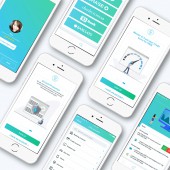
EZ personal finance is really unique by targeting a group of people aging 18-35 years old who are tech-savvy and are eager to use money wisely. It has intuitive navigation for the first-time user. It focuses on the following user pain points based on user research: saving money, paying loans and bills on time, monitoring spending activities, and managing credit scores. Besides the customized features, this mobile app also provides the aesthetically pleasing but simple design with the guidance of flat and minimalist design styles. The whole icon suite and graphics are designed to mirror the Din typeface and to deliver the right message around the context, creating a sense of uniqueness.
OPERATION / FLOW / INTERACTION:
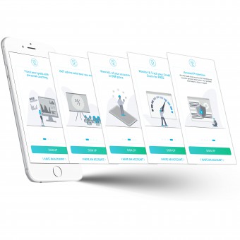
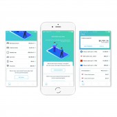
This mobile application is created as the main platform of personal finance management for young people where we can continue adding more features to it. When the first-time users download and open this app, they will be exposed to the aesthetically pleasing but simple onboarding pages illustrating the competitive advantages of this app. Then, the users will be directed to the enrollment flow. This flow adopts conversational design to make the flow more interesting and enhance positive user experience in UI/UX design. After the users provide all necessary information, they are able to explore more within the app, such as setting up personal goals and notifications to pay loans and bills, linking banking accounts, monitoring and analyzing spending activities, etc.
PROJECT DURATION AND LOCATION:
The duration of this project is three months, from Jan to March 2019.
The location is in NYC.
|
PRODUCTION / REALIZATION TECHNOLOGY:
The creation of EZ personal finance is mainly based on UX thinking process. The icon shapes and graphics were created in Adobe Illustrator, the wireframes, user flow, and hi-fi mockups were designed in Sketch, the interactive prototype was finished in InVision, and then handed off all design works to the developers. This mobile app was finally built by JAVA, Ruby, HTML, CSS, and PHP. Here is the snapshot of the process: 1) the user research was conducted to find out users' pain points; 2) competitors' products were analyzed to study their pros and cons; 3) two detailed personas were created to drive the design direction for customizing features, graphics & icons, and content. Then, all necessary design works were created in Adobe Illustrator, Sketch, and InVision. Finally, 8 usability testings were implemented via Usertesting.com to get real feedback from target users. The revised design of this mobile app was shared with the developers.
SPECIFICATIONS / TECHNICAL PROPERTIES:
Available in the mobile app store (iOS & Android), Digital Branding, Logo Design, Content Strategy.
TAGS:
Finance, Financial Planner, Save Money, Pay Loan, Mobile, iOS, iPhone
RESEARCH ABSTRACT:
During the development of EZ personal finance, the user research was conducted among 50 people to find out the user pain points via SurveyMonkey. We found out that young people aging 18-35 years old want to develop the desired behaviors to save and spend money wisely, and set up personal goals and notification to remind themselves. However, current apps on the market do not have the good performance targeting the user pain points discussed above. Based on the findings generated from the competitor's analysis through Excel, there is no section to customize the types of goals, such as paying the personal loans or bills or debts, let alone the customized goals for young people, like student loan and the auto loan. Besides the user research and competitor analysis, 8 usability testings were conducted via Usertesting.com to collect real feedback regarding the mobile app.
CHALLENGE:
The challenging part of this project is to create aesthetically pleasing but simple graphics and icons reflecting EZ personal finance's branding, mirroring the Din typography, and translating the message in the context correctly. When it comes to visual design, we wanted to design an icon suite and a set of graphics that reflect our brand. At the same time, the icon suite and graphics were designed to mirror the Din typography creating the uniqueness of EZ personal finance. Besides the visual design, we needed to consider the functional design. As the app grows, there is a need to create flexible design assets including icons and graphics on different platforms and screen sizes. Moreover, we designed these elements in the simplest form, considering the bare minimum needed to convey the idea. Finally, we took the contextual design into consideration. Each design element was designed around its context to reflect the message correctly. Therefore, making the icon suite and graphics simple, responsive, and conveying the message precisely are important in this project.
ADDED DATE:
2019-03-30 21:22:47
TEAM MEMBERS (3) :
Design & Content: Ran Li, Front end developer: Leong and Back end developer: Vicent
IMAGE CREDITS:
All image/photos credits to Ran Li.
|
