Feres & Bertagni Law Office Visual Identity by Yuri Miranda |
Home > Winners > #85411 |
 |
|
||||
| DESIGN DETAILS | |||||
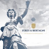
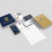
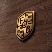
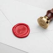
| DESIGN NAME: Feres & Bertagni PRIMARY FUNCTION: Law Office Visual Identity INSPIRATION: I was inspired by the heraldry and coats of arms tradition. I needed the symbol to be strong and respectful, so they could be perceived as truthful law office. UNIQUE PROPERTIES / PROJECT DESCRIPTION: Visual Identity Project for Feres & Bertagni Sociedade de Advogados. A Law office situated in São Paulo, Brazil. Based on the classic form of the coat of arms representing nobility, security, solidity. They were a new office, composed of 2 partners, seeking a strong identity. OPERATION / FLOW / INTERACTION: Being a visual identity, it is recommended to follow the brandbook for application at all of the customer contact points. In this project, we carried out all the stationery, labeling and standardization of e-mails and other legal materiais that portrait the use of the new Id. PROJECT DURATION AND LOCATION: Made in Brazil, in São Paulo, in the office of my house, with a total duration of 1 month in August 2015. FITS BEST INTO CATEGORY: Graphics, Illustration and Visual Communication Design |
PRODUCTION / REALIZATION TECHNOLOGY: Inspiration, imagination, pencil and adobe illustrator. SPECIFICATIONS / TECHNICAL PROPERTIES: We delivered a full Brand Book with all the correct specs for use and application of the new Brand. Like min and max size of use, colors, fonts, when to use the primary or the secondary version and more. TAGS: heraldic, brand, lawyers, coat of arms, tradition, RESEARCH ABSTRACT: A lot of research on heraldry and coats of arms design , about the last name of each partner so that we could translate the information into a relevant graphic concept. CHALLENGE: the biggest challenge was to find the balance between tradition and how to show the partnership in a symbol. But from the beginning I had a drawing in mind, which in the end ended up becoming 80% of the project in its final form. ADDED DATE: 2019-03-29 15:15:59 TEAM MEMBERS (1) : IMAGE CREDITS: Yuri Miranda, 2018. |
||||
| Visit the following page to learn more: http://www.behance.net/gallery/29180569/ |
|||||
| AWARD DETAILS | |
 |
Feres & Bertagni Law Office Visual Identity by Yuri Miranda is Winner in Graphics, Illustration and Visual Communication Design Category, 2018 - 2019.· Press Members: Login or Register to request an exclusive interview with Yuri Miranda. · Click here to register inorder to view the profile and other works by Yuri Miranda. |
| SOCIAL |
| + Add to Likes / Favorites | Send to My Email | Comment | Testimonials | View Press-Release | Press Kit | Translations |

