Logotype SETMA Logotype by Mateus Matos Montenegro |
Home > Winners > #85377 |
 |
|
||||
| DESIGN DETAILS | |||||
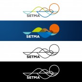
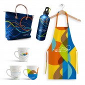
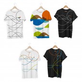
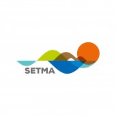
| DESIGN NAME: Logotype SETMA PRIMARY FUNCTION: Logotype INSPIRATION: The logotype appropriates the natural wonders of the municipality to represent in a drawing everything that it offers to its tourists and visitors. From the lagoon, the serrote, the pierced stone, the sea and the iconic sunset on the dunes. To unify all these elements, we use harmonious curved sine-wave elements, which represent the frequency, balance, harmony and equilibrium between all the natural beauty and the transcendent experience it provides. UNIQUE PROPERTIES / PROJECT DESCRIPTION: The SETMA, the Municipal Tourism and Environment secretariat, brand of Jijoca de Jericoacoara must be what the municipality and its environment represents for all the people who enjoy the unique and wonderful moments of happiness and peace there. It must be an extremely expressive brand, but light and harmonious. A visual representation of a paradise. OPERATION / FLOW / INTERACTION: From the beginning of the project, the main idea was to have a harmony, an energy, a flow in which the design would represent the environmental wonders with de transcendent feeling of its users. PROJECT DURATION AND LOCATION: The project started by the end of January 2018 and ended in the middle of March 2018. FITS BEST INTO CATEGORY: Graphics, Illustration and Visual Communication Design |
PRODUCTION / REALIZATION TECHNOLOGY: The mais insight of the design was to unify all the main city elements using the harmony that their own environment provides, with the sine curves waves in resonance with nature. SPECIFICATIONS / TECHNICAL PROPERTIES: The logo showcases the five colorful natural elements that unify and represent the city of Jijoca de Jericoacoara. We transformed these elements in icons and unified those using harmonious sine waves curves, implying they are all part of one environment. We overlapped the elements that connects between themselves. TAGS: Jijoca de jericoacoara, setma, logotype, environment, harmony, transcendent, tourism RESEARCH ABSTRACT: The research for the design was to find what where the main elements of the city. Witch ones represented more the city as a whole. The collection of data came from a study related do images from social media and which ones were most shared by its visitors. CHALLENGE: The main creative challenge in the concept was to find a way to be simple, but at the same time represents the whole city, environment and the amazingness feeling of freedom, all together connected with nature. We found this harmony in the sine waves that represent all life. We are all made of energy waves that resonate with each other and our environment. ADDED DATE: 2019-03-29 13:30:49 TEAM MEMBERS (1) : Mateus Matos Montenegro IMAGE CREDITS: Mateus Matos Montenegro, 2018. |
||||
| Visit the following page to learn more: http://bit.ly/2VBdR1g | |||||
| AWARD DETAILS | |
 |
Logotype Setma Logotype by Mateus Matos Montenegro is Winner in Graphics, Illustration and Visual Communication Design Category, 2018 - 2019.· Press Members: Login or Register to request an exclusive interview with Mateus Matos Montenegro. · Click here to register inorder to view the profile and other works by Mateus Matos Montenegro. |
| SOCIAL |
| + Add to Likes / Favorites | Send to My Email | Comment | Testimonials | View Press-Release | Press Kit | Translations |


