1869 Principe Real Branding by Joao Loureiro |
Home > Winners > #85053 |
 |
|
||||
| DESIGN DETAILS | |||||
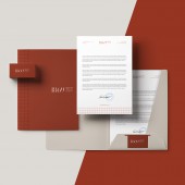
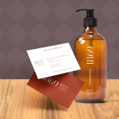
| DESIGN NAME: 1869 Principe Real PRIMARY FUNCTION: Branding INSPIRATION: To create a unique and timeless identity, I was inspired by the architectural features of this beautiful palace, in its color and elements, while giving it a Portuguese look, working the 1869 as the old door numbers. In its aplication, I've made also a pattern inspired in the tiles they have in the building entrance and in the most typical Portuguese houses. These details, combined with modern typography and iconography, gives character and contemporaneity to the brand. UNIQUE PROPERTIES / PROJECT DESCRIPTION: 1869 Principe Real is a Bed and Breakfast situated in the most trendy place in Lisbon - Principe Real (the next door neighbor is Madonna). This Bed and Breakfast is located in an 1869 old palace, keeping the old charm with a contemporary design, giving it a premium and luxurious look and feel. I was required to incorporate these values into its identity. OPERATION / FLOW / INTERACTION: We were really meticulous with the materials used in the brand supports. We want the 1869 Principe Real guest to have the greatest experience ever. We explore designs with high attention to detail and convict that they are easy to use, feel and read. With that, we have a coherent and careful placed visual communication. PROJECT DURATION AND LOCATION: The project started in 2017 and finished in mid 2018. FITS BEST INTO CATEGORY: Graphics, Illustration and Visual Communication Design |
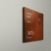
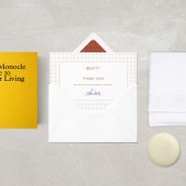
PRODUCTION / REALIZATION TECHNOLOGY: This identity was mainly made with Adobe Creative Suite. All the brand collateral was printed on high-quality paper using Pantone colors. For the signage, we've used a rust-looking Corten Steel with laser engraving finish. All of these supports were produced in certified and specialized companies to guarantee the best result possible. SPECIFICATIONS / TECHNICAL PROPERTIES: Business Cards: 85 x 55 mm, Couche Matte 400g, 1/1 Colors. Letterhead: 210 x 297 mm, IOR 90g, 1 Color. Envelopes: 220 x 110 mm, IOR 90g, 1 Color. Outdoor Signage: 700 x 700 mm, Corten Steel with laser engraving. Room Signage: 250 x 150 mm, Corten Steel with white paint. TAGS: Branding, Hotel, Identity, Logo, Design, Portugal RESEARCH ABSTRACT: To create a unique and timeless identity, I was inspired by the architectural features of this beautiful palace, in its color and elements, while giving it a Portuguese look, working the 1869 as the old door numbers. In its application, I've made also a pattern inspired in the tiles they have in the building entrance and in the most typical Portuguese houses. These details, combined with modern typography and iconography, gives character and contemporaneity to the brand. The L element in the Real word was longed to design a stylized bed icon, reinforcing that is a bed and breakfast. CHALLENGE: The hardest part of the process was to find the best material to make all the space signage that has a modern yet luxurious look and feel. For that, we've discussed multiple solutions and we believe that Corten Steel was a perfect choice and combines beautifully with space and it's color palette. ADDED DATE: 2019-03-28 11:48:21 TEAM MEMBERS (1) : IMAGE CREDITS: Designer João Loureiro, Artworks, 2017. |
||||
| Visit the following page to learn more: http://www.joaoloureiro.pt | |||||
| AWARD DETAILS | |
 |
1869 Principe Real Branding by Joao Loureiro is Winner in Graphics, Illustration and Visual Communication Design Category, 2018 - 2019.· Press Members: Login or Register to request an exclusive interview with Joao Loureiro. · Click here to register inorder to view the profile and other works by Joao Loureiro. |
| SOCIAL |
| + Add to Likes / Favorites | Send to My Email | Comment | Testimonials | View Press-Release | Press Kit | Translations |

