Green Asparagus Packaging Design by Salvita Bingelyte |
Home > Winners > #82960 |
 |
|
||||
| DESIGN DETAILS | |||||
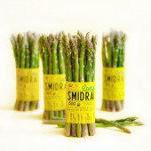
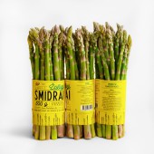
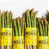
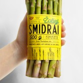
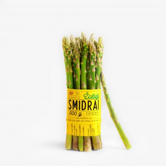
| DESIGN NAME: Green Asparagus PRIMARY FUNCTION: Packaging Design INSPIRATION: Asparagus is the first vegetable in the world that grows during the spring in cultivated conditions. Green asparagus gets its color from sunlight. When the plant breaks through the ground, the sun hits it, turning it green. The sun is very important for asparagus, so I thought it would be a good idea to focus on yellow, because it symbolizes the sun, light and spring. UNIQUE PROPERTIES / PROJECT DESCRIPTION: I created asparagus labels. With the concise yellow color and lettering, the new brand creates high visibility, speed and memory. The design clearly puts Green Asparagus words first and foremost, but it is cleverly integrated into a block of exuberant type which conveys a playful, bright image. By using linear growing asparagus drawings, it creates a twist on the classic style, because behind each step in the cultivation process, from planting and cutting to packaging, there is a skillful hand. OPERATION / FLOW / INTERACTION: Lettering and hand drawn asparagus illustrations reflect the natural, fresh aspect of the product. Asparagus is not a popular vegetable, so on the label, we decided to write information on how to store, prepare and cook them, including a recipe for making delicious asparagus. PROJECT DURATION AND LOCATION: Started in March 2018 and finished May 2018 in Vilnius, Lithuania. FITS BEST INTO CATEGORY: Packaging Design |
PRODUCTION / REALIZATION TECHNOLOGY: For the label design, I opted for digitally printed labels on white paper. A rubber band binds the asparagus bundle. I chose a yellow rubber band, so that it would blend in with the label. SPECIFICATIONS / TECHNICAL PROPERTIES: The label design size is 220 mm x 100 mm, on a bundle holding 500 g of asparagus. TAGS: Asparagus, packaging, label design, branding, graphic design, Salvita Design, Lithuania RESEARCH ABSTRACT: Food packaging always comes in color, but it is uncommon to focus on one color. The one color, in addition to the bright, crinkly yellow paper, the charming script type and hand drawn asparagus, give it a feeling of freshness. The goal was to appeal to a customer interested in healthy nutrition. CHALLENGE: To create a packaging for a small farm that would stand apart from the other asparagus on the market and easily flow to other products. ADDED DATE: 2019-03-06 13:14:52 TEAM MEMBERS (1) : IMAGE CREDITS: Salvita Bingelyte (Set Design and Prop Styling) |
||||
| Visit the following page to learn more: https://www.salvita.lt | |||||
| AWARD DETAILS | |
 |
Green Asparagus Packaging Design by Salvita Bingelyte is Winner in Packaging Design Category, 2018 - 2019.· Read the interview with designer Salvita Bingelyte for design Green Asparagus here.· Press Members: Login or Register to request an exclusive interview with Salvita Bingelyte. · Click here to register inorder to view the profile and other works by Salvita Bingelyte. |
| SOCIAL |
| + Add to Likes / Favorites | Send to My Email | Comment | Testimonials | View Press-Release | Press Kit |
Did you like Salvita Bingelyte's Packaging Design?
You will most likely enjoy other award winning packaging design as well.
Click here to view more Award Winning Packaging Design.


