Allinson's Branding by Springetts |
Home > Winners > #82668 |
 |
|
||||
| DESIGN DETAILS | |||||
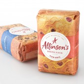
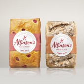
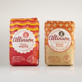
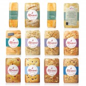
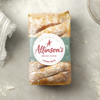
| DESIGN NAME: Allinson's PRIMARY FUNCTION: Branding INSPIRATION: Flour is being considered as a commodity. The category is seeing home bakers opting for own label flour over branded as there is little differentiation as to why they should pay more. Our task was to re-establish Allinson’s as the brand for Bakers, to disrupt the fixture with a distinctive and powerful redesign so that consumers understand that Allinson’s can’t be substituted for own label. Flour is anything but plain. We wanted to bring the joy of home baking back to the forefront of the Allinson’s brand. In-store bakeries are one of the most emotive aisles in the supermarket. We’ve seen a rise in artisan bakeries on the high-street & social media outlets such as Pinterest are full of inspiration for home bakers. Yet the flour aisle doesn’t evoke any of these positive feelings. UNIQUE PROPERTIES / PROJECT DESCRIPTION: We wanted to remind home bakers that nothing compares to homemade, but how do you create a jolt on shelf when all flour bags look the same? We noticed that the structure of the bag lent itself to the perfect loaf size, and once picked up, even felt as if you could be squeezing a fresh loaf. By designing the packs to look as if they were freshly made breads and cakes on a bakery shelf, we created the allure of the artisan bakeries they were inspired by, into the flour aisle. OPERATION / FLOW / INTERACTION: - PROJECT DURATION AND LOCATION: The project started in January 2018 and finished in September 2018 in London, United Kingdom. FITS BEST INTO CATEGORY: Packaging Design |
PRODUCTION / REALIZATION TECHNOLOGY: We hand baked and photographed a different loaf or cake for every pack. Photography of each loaf continues onto the sides and back of pack, fully creating the illusion of a freshly made bread or cake. It was important to craft the design to reflect the craft of the product inside, working with a typographer, we developed a hand-written marque which strengthened the Allinson’s A and aligned it with their existing star icon. SPECIFICATIONS / TECHNICAL PROPERTIES: Strong White 1.5kg Flour Bag: Width 115mm x Depth 75mm x Height x 185mm Strong White 500g Flour Bag: Width 76mm x Depth 57mm x Height 125mm TAGS: springetts, flour, design, allinsons, packaging RESEARCH ABSTRACT: Allison's wanted to understand the strength of it's existing assets in order to inform an effective design brief. Using IcAT - A science based to measure the impact of brand properties, we researched 29 of Allison's assets on an online implicit test. The test took a sample of 375 people, all flour buyers, 75 of which were specifically Allison's buyers. This research was conducted on 6-10th April 2018 and was tested against their market competitors Hovis, Doves Farms, Carr's and Wright's Baking. The results of the research were used to unlock the power of their brand properties and distinguish which elements are own-able to Allison's or their competitors. CHALLENGE: We were restricted to a classic flour bag packaging format, which held no differentiation over the competitors and matt printing, which can appear dull on shelf. We wanted to use the flour bag restrictions to an advantage, we noticed the format lent itself to the perfect loaf size, and once picked up, even felt as if you could be squeezing a fresh loaf. ADDED DATE: 2019-03-05 12:27:54 TEAM MEMBERS (3) : Creative Director: Paul Williams, Design Director: Lou Elms and Senior Designer: Sophie Burt IMAGE CREDITS: Main Image: Stuart Witter Image #1: Stuart Witter Image #2: Stuart Witter Image #4: Stuart Witter |
||||
| Visit the following page to learn more: https://www.springetts.co.uk | |||||
| CLIENT/STUDIO/BRAND DETAILS | |
 |
NAME: Springetts PROFILE: Springetts are a design agency based in London that have been creating brand love for over 40 years. |
| AWARD DETAILS | |
 |
Allinson's Branding by Springetts is Winner in Packaging Design Category, 2018 - 2019.· Read the interview with designer Springetts for design Allinson's here.· Press Members: Login or Register to request an exclusive interview with Springetts. · Click here to register inorder to view the profile and other works by Springetts. |
| SOCIAL |
| + Add to Likes / Favorites | Send to My Email | Comment | Testimonials | View Press-Release | Press Kit |
Did you like Springetts' Packaging Design?
You will most likely enjoy other award winning packaging design as well.
Click here to view more Award Winning Packaging Design.


