Cervinago Rosso Packaging Design by Luigi Mazzei |
Home > Winners > #81713 |
 |
|
||||
| DESIGN DETAILS | |||||
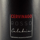
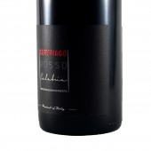
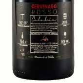
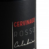
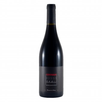
| DESIGN NAME: Cervinago Rosso PRIMARY FUNCTION: Packaging Design INSPIRATION: The branding strategy of the label, inspired by noir movies 40s styles, conveys on the front of the bottle the playful and utopian values of the product and on the back the critical ones. The label, with a black background, takes the same atmosphere of the noir movies 40s styles, in which the main character was often an elegant seductive and mysterious woman. UNIQUE PROPERTIES / PROJECT DESCRIPTION: Thanks to the usage of a typeface 30s styles, the bottle has been dressed with a dark dress, at the same time elegant and seductive. The red lettering of Cervinago predominates over the entire label, and represents the dark lady of cinematographic stereotype of those years. The red revokes both the hidden content of the bottle and the lipstick of the dark lady on the glass, common picture in the movies. OPERATION / FLOW / INTERACTION: The main pillars of the communication strategy are quality, territory and origin. The above mentioned values are reflected in the communication path of the label, aimed at informing the customers on the whole production cycle of Cervinago. The infographics on the back of the label have been designed to be engaging peoples, giving clues of the main features of the wine as the year, serving temperature and alcoholic richness. The main goal of the icons is to support the customer that is habits to read less and less because he is influenced by the prevailing and overabundant web communication full of text. PROJECT DURATION AND LOCATION: The project lasted five months, from February 2017 to July 2017 and it was created in Trebisacce (Cosenza, Italy). It was shown at 2018 in Verona at Vinitaly International Packaging Competition 2018 (Winning the Bronze Label) FITS BEST INTO CATEGORY: Packaging Design |
PRODUCTION / REALIZATION TECHNOLOGY: An uncoated, matt, woodfree printing paper with a tactile hand made appearance and feel. Wet strength and anti fungicidal treated it is specially designed for the labeling of luxury goods, wines and beverages in particular. SPECIFICATIONS / TECHNICAL PROPERTIES: Wine bottle 75 cl Height : 280mm Diameter : 68mm The label consists of two parts: the main label (80 x 110 mm), and the back label (70 x 80 mm) TAGS: wine, label, packaging, Packaging design, brand identity, Cervinago RESEARCH ABSTRACT: Starting from the key contents (from the conceptual basis) of the semiotic square of Floch (that defines the conceptual reason according to which a consumers choose a good or a service), the branding strategy of the label, inspired by noir movies 40s styles, conveys on the front of the bottle the playful and utopian values of the product and on the back the critical ones. Seduction and mystery, playful and utopian values capture the attention of the consumer, inviting him to discover the content of the bottle and the geographical area in which it is born. CHALLENGE: The invite to discover the mystery through the seduction of the product is a metaphorical recall to the conceptual exceedance of little known territory of Alta Ionian Calabria, out of the mass tourist destinations and ideal for lovers of natural and rural experiences linked to the high quality products poorly known and procurable. ADDED DATE: 2019-02-28 18:20:48 TEAM MEMBERS (1) : Designer: Luigi Mazzei IMAGE CREDITS: Image#1: Photographer Luigi Mazzei, 2019 Optional Image#1: Photographer Luigi Mazzei, 2019 Optional Image#2: Photographer Luigi Mazzei, 2019 Optional Image#3: Photographer Luigi Mazzei, 2019 Optional Image#4: Photographer Luigi Mazzei, 2019 Image Profile: Photographer Gaetano Gianzi, 2019 Video Credits: Luigi Mazzei, 2019 |
||||
| Visit the following page to learn more: http://bit.ly/2HRJtwl | |||||
| AWARD DETAILS | |
 |
Cervinago Rosso Packaging Design by Luigi Mazzei is Winner in Packaging Design Category, 2018 - 2019.· Press Members: Login or Register to request an exclusive interview with Luigi Mazzei. · Click here to register inorder to view the profile and other works by Luigi Mazzei. |
| SOCIAL |
| + Add to Likes / Favorites | Send to My Email | Comment | Testimonials | View Press-Release | Press Kit | Translations |

