CZ Bank Logo and Visual Identity Financial Services by Hongbin Yang, Shuai Wang and Qina Qiu |
Home > Winners > #81348 |
 |
|
||||
| DESIGN DETAILS | |||||
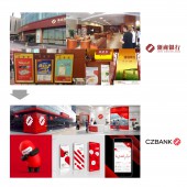
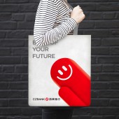
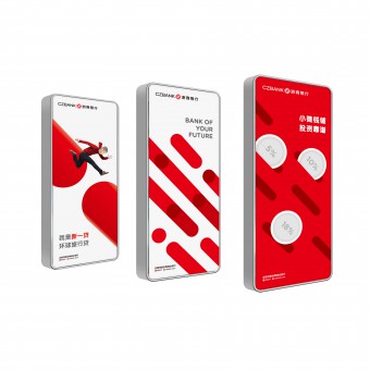
| DESIGN NAME: CZ Bank Logo and Visual Identity PRIMARY FUNCTION: Financial Services INSPIRATION: CZ bank was positioned as an innovator of the new age to embrace the upcoming economy and customers. This is the starting point for the creative work. In the meanwhile, the bank has over 10 years of history and built a good amount of visual asset which deserves to be recognized. Under this background, designers employed the concept of “embracing the new”. The new logo seems like hugging hands and is ready to welcome the new market. UNIQUE PROPERTIES / PROJECT DESCRIPTION: CZ bank is one of 12 nation-wide joint-stock commercial banks in China,headquartere OPERATION / FLOW / INTERACTION: - PROJECT DURATION AND LOCATION: The rebranding project started in July 2015 in Hangzhou, China. The launched event happened in August in Beijing, China. Later on, the store branches kept opening. Internal and External communications continually released to strengthen the new image. FITS BEST INTO CATEGORY: Graphics, Illustration and Visual Communication Design |
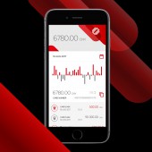
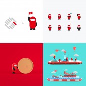
PRODUCTION / REALIZATION TECHNOLOGY: - SPECIFICATIONS / TECHNICAL PROPERTIES: - TAGS: Logo, Corporate Identity, bank, retail, rebranding, Brand IP RESEARCH ABSTRACT: By immersing into the project, designers and strategists as a team undertook 3 months to an intensive research, include deep interviews, focus groups, store visiting to CZ banks and its peer flagship stores in 6 cities, as well as auditing its multiple digital channels and touch points. The core finding is the discovery that CZ bank’s century-old store style was very irrelevant to the new age and to the young-aged audiences. The brand image needs to be refresh, agile and holistic. CHALLENGE: The biggest challenge for this project is how to upgrade the logo to be modern, while recognizing the legacy of the existing logo. It looks very traditional and century-old like. Besides the logo design, what personality the brand will show to the market is the next challenge for the designers. At the end, the red bar, also called energy bar, was created to play a role in giving the brand some agile element. As part of the visual identity system, it is used in multiple interfaces, such as websites, ad posters, stationaries and social media. It even turned into an IP icon acting as chief insights-finding officer to seek for young people’s under-served financial needs, and started conversion with its target audience. Results are obvious in attracting young people to get engaged. Also, young employees were highly inspired by the new look and felt proud of the bank they were working for. ADDED DATE: 2019-02-28 12:26:11 TEAM MEMBERS (8) : Hongbin Yang, Xuehan Ren, Shuai Wang, Qina Qiu, Zhijun Li, Jean-Pierre Lacroix, Bing Ma and Wen Wen IMAGE CREDITS: Hongbin Yang, Shuai Wang and Qina Qiu, 2018. |
||||
| Visit the following page to learn more: http://For more information about this design:http://www.czbank.com | |||||
| AWARD DETAILS | |
 |
Cz Bank Logo and Visual Identity Financial Services by Hongbin Yang, Shuai Wang and Qina Qiu is Winner in Graphics, Illustration and Visual Communication Design Category, 2018 - 2019.· Press Members: Login or Register to request an exclusive interview with Hongbin Yang, Shuai Wang and Qina Qiu. · Click here to register inorder to view the profile and other works by Hongbin Yang, Shuai Wang and Qina Qiu. |
| SOCIAL |
| + Add to Likes / Favorites | Send to My Email | Comment | Testimonials | View Press-Release | Press Kit |

