Axis Residential Development by dhk Architects |
Home > Winners > #81234 |
 |
|
||||
| DESIGN DETAILS | |||||
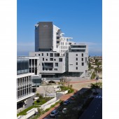
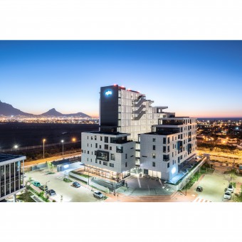
| DESIGN NAME: Axis PRIMARY FUNCTION: Residential Development INSPIRATION: Axis is an off-white, sculpted apartment block that was conceived as a monolith with indentations and cut-outs. Elements of Axis are embedded in abstract narratives paying homage to classic literature; from the crown-shaped crescendo to the three urban courts, while conversely responding to contentious aspects of the realities of apartment living. For example, the large gestural cuts and gashes in the building offer views of Robben Island, Intaka Island and Tygerberg Hills; allowing for stunning outward views even from the innermost crevices of the building. UNIQUE PROPERTIES / PROJECT DESCRIPTION: Axis includes 85 luxury residential apartments and penthouses supplemented with small-scale commercial and retail space at ground level. The building connects to the environment in a myriad of strategic ways and sets a precedent for urban conscious residential developments in the city. The compact form of the building wraps around itself and gradually rises, orientating most of the apartments towards picturesque views of Cape Town’s CBD, Table Mountain and the Atlantic Ocean. OPERATION / FLOW / INTERACTION: A public urban plaza has been introduced as a forecourt and arrival space that is fed by routes along Bridgeways Precinct’s pedestrian network and leads into the building’s courtyard. To transport inhabitants, a large panoramic lift runs the full height of the building and is positioned at the pinnacle of its mass. In terms of the apartments, each unit has been designed to optimise views, light and to provide a generosity of space that extends to the provision of ample external terraces. High-quality finishes have been specified both internally and externally to ensure the long-lasting beauty of the modish design. A 24-hour concierge in the entrance court completes the exclusive nature of the complex. PROJECT DURATION AND LOCATION: Occupying a prominent corner position in blossoming Bridgeways Precinct in Century City, Cape Town (South Africa), the landmark development has been designed to capitalise on enviable views of Cape Town’s CBD, Table Mountain and the Atlantic Ocean. Construction started March 2017 and was completed in November 2018. FITS BEST INTO CATEGORY: Architecture, Building and Structure Design |
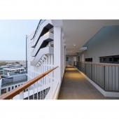
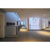
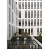
PRODUCTION / REALIZATION TECHNOLOGY: The unique doughnut-shaped form is adorned with visual gashes that allow the sheltered walkway spaces to catch glimpses of the city around it, connecting the inside circulation to the outside world. The rising form cuts away, creating dynamic terraces and activity at differing heights, culminating in generous penthouse units. Contributing to the contemporary aesthetic of the building, 2500mm x 1200mm sheets of satin off-white aluminium composite panels (ACP) were used to wrap the facade. SPECIFICATIONS / TECHNICAL PROPERTIES: At the heart of the building is a deep fissure, as a result of the negative space created by the building form wrapping on itself. This deep 30m x 13m space acts as a light chasm that catches the north light and delivers it down to even the lowest floors. The internal, sheltered courtyard features a textured white-painted face brick fenestration which was intentionally designed to complement the smooth, sleek external cladding. TAGS: Axis, dhk, architecture, building, design, apartment block, RESEARCH ABSTRACT: The approach of utilising the aluminium composite panels was to clearly define the monolithic appearance with the natural play of sunlight and deep shadows creating the articulation. The panels were bent and pressed to form 20mm cassettes used to create the profile of a large format tiled finish. The cladded panels have been staggered, within 1200mm grid centres, while the building fenestration is equally staggered but on a wholly separate 1800mm grid, creating the complex randomised fenestration appearance. CHALLENGE: A major element of the design concept was the idea of a floating monolith. To achieve this, the architects and engineers devised a "belt beam" detail that wrapped around the entire building on the first floor. This consisted of a 500mm deep slab thickening around the edge of the building and a 1000mm upstand that doubled up as the balcony balustrade on level one. This difficult detail resolution allows 10 storeys to appear to rest on glass. Another major challenge was the facade system which was designed very specifically to appear as an overscaled tiling system. Each panel had to be scheduled and coordinated with the window openings; to achieve this, the building was scanned, and the panels were individually placed in their exact position. ADDED DATE: 2019-02-28 10:12:18 TEAM MEMBERS (6) : dhk Architects, Rabie Property Group, WBHO, RLB Pentad, Aurecon and JD Reitz IMAGE CREDITS: Dave Southwood / Wieland Gleich |
||||
| Visit the following page to learn more: http://www.dhk.co.za/project/axis/ | |||||
| AWARD DETAILS | |
 |
Axis Residential Development by Dhk Architects is Winner in Architecture, Building and Structure Design Category, 2018 - 2019.· Read the interview with designer dhk Architects for design Axis here.· Press Members: Login or Register to request an exclusive interview with dhk Architects. · Click here to register inorder to view the profile and other works by dhk Architects. |
| SOCIAL |
| + Add to Likes / Favorites | Send to My Email | Comment | Testimonials | View Press-Release | Press Kit |
Did you like Dhk Architects' Architecture Design?
You will most likely enjoy other award winning architecture design as well.
Click here to view more Award Winning Architecture Design.


