DESIGN NAME:
Village Foods
PRIMARY FUNCTION:
Office
INSPIRATION:
The company has many visitors who are looking to become a franchise owner or partner.
Since this office reflects the image of the company, its design was required to represent ideas and values of the company.
UNIQUE PROPERTIES / PROJECT DESCRIPTION:
What crossed our mind as we began to design the layout, is how the office environment of a company that is rapidly expanding a restaurant business should be. We ignored monotonous and stereotypical images of workspace, and decided to aim for an office that makes people feel that work is fun. We did this by creating a space that replicates the look of a store, carefully selecting materials for the interior, as to bring joy and excitement to the people visiting.
OPERATION / FLOW / INTERACTION:
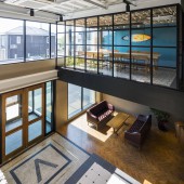
The first floor has an entrance hall and a central kitchen in the middle while the second floor has a space with a focus on office function, realizing a clear functional division between two floors.
When stepping into the open-ceiling entrance hall, there appears a grand staircase in front leading us straight to the second floor . The aim was to give visitors a surprise and excitement for what is to come. The grand staircase and the surrounding walls were finished by meticulously gluing tile-like wood strips. The entrance hall and adjacent lobby space look solid and professional.
The office space for clerical duties and the meeting rooms connected from the second-floor hall are divided by figured glass, to ensure spacious atmosphere, while loosely partitioning the space.
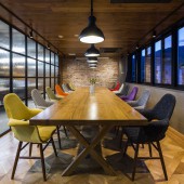
We arranged the cafeteria for employees across from the open-ceiling entrance hall. This was to create a comfortable space to refresh oneself with an open atmosphere, like a coffee shop where one can relax around a spacious dining table.
PROJECT DURATION AND LOCATION:
The project started in October 2015 and finished and opened in February 2017 in Tahara city, Aichi, JAPAN
FITS BEST INTO CATEGORY:
Interior Space and Exhibition Design
|
PRODUCTION / REALIZATION TECHNOLOGY:
For the finish, we selected expressive genuine materials, such as solid wood boards, natural stones, and cement and mosaic tiles. By assembling and laminating fragments of these materials in open space, we tried to express joyful abundance.
With various materials layering on each other utilizing their attributes, the finished design turned out to be very profound.
SPECIFICATIONS / TECHNICAL PROPERTIES:
Total area:250 square meters
TAGS:
Office, Aichi, Tahara, antique brick, Restaurant
RESEARCH ABSTRACT:
The exterior walls are covered with genuine antique brick tiles used in Vietnamese buildings when the country was ruled by France. We thought to make the best out of these tiles by lining them with various patterns, rather than monotonously juxtaposing them, because their shape and size are irregular. While maintaining a light impression, the exterior holds the strength and beauty that impresses guests with craftsmen’s time consuming tiling work.
CHALLENGE:
-
ADDED DATE:
2019-02-28 09:12:03
TEAM MEMBERS (1) :
IMAGE CREDITS:
All photos / HIROYUKI OKI
|


