DESIGN NAME:
StarSharing Blue and White
PRIMARY FUNCTION:
Nutritional Supplement Packaging
INSPIRATION:
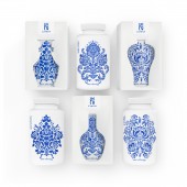
This is a brand of nutritional supplements produced in jiangxi province, China. Jiangxi province is a famous porcelain capital in China, since ancient times, it abounds in blue and white porcelain, which is the source of inspiration for packaging design and thus obtains the regional visual characteristics of the brand. This product is made of pure natural organic plant ingredients and extracted by high-tech technology to make the product as pure as possible. The biggest selling point of this product is that the company has been deeply engaged in nutritional supplements for many years and has developed safe and efficient products, which are more beneficial to human health and absorption. Therefore, we define the product temperament in the "clean and safe", in order to maximize the brand characteristics.
Finally, the pure white environment-friendly plastic material is selected to reduce the weight of the product and preserve the efficacy of the product, so on the packaging material, get the white of packaging, and highlight the purity of the product ingredients. The blue color of blue and white porcelain is obtained through the plant pattern design of three classic blue and white porcelain, Highlight the safety of product content with plant elements. In the plant pattern, the pattern is combined into the shape of water droplets, which also implies the production process of blue and white porcelain. Blue and white porcelain is derived from the water and soil in nature. Through the complex technology of the proportion between the two, it is elaborately produced by craftsmen.
In the design of the outer box, we adopted the carton cutting design method of originality. So that hidden in the museum of blue and white porcelain, in a moment, presented in front of consumers. The paper box does not do any printing, in order to reduce the pollution caused by printing. visually, and make the blue and white pattern get perfect display.
In this way, the brand has Chinese regional characteristics, making the overall visual effect unique, while retaining a strong taste of Oriental blue and white porcelain, Let consumers in the process of consumption, experience the different feelings brought by the design.
UNIQUE PROPERTIES / PROJECT DESCRIPTION:
This design is inspired by Oriental porcelain and injects connotation into the brand. The advantage of this design is that it breaks the traditional way of designing the packaging of nutritional supplements, does not use any effective text publicity, and presents the packaging in a clean and comfortable style in front of consumers, thus in the nutritional supplement retail industry to stand out. The advantage of this kind of design is to shorten the distance with consumption through the background of Oriental culture.
OPERATION / FLOW / INTERACTION:
Very simply gently tear off the sticker on the top of the package, then open the cato, take out the inner bottle, open the lid and use the product.
PROJECT DURATION AND LOCATION:
The project started in Shanghai in June 2018 and was completed in Shanghai in December 2018. After that, the products were launched on the market.
FITS BEST INTO CATEGORY:
Packaging Design
|
PRODUCTION / REALIZATION TECHNOLOGY:
The package consists of an inner bottle, an outer box and a sticker. The inner bottle is pure white PET plastic, the surface pattern is presented through screen printing, Match pantone color. The outer box is made of a piece of white cardboard, including the function of buckle, so that the pattern is presented at a reasonable Angle. The box does not contain any printing, only cutting the outline of the porcelain bottle. The sticker is a white plastic film with a brand series pattern to distinguish the categories.
SPECIFICATIONS / TECHNICAL PROPERTIES:
width80mm x highly150mm x depth80mm
TAGS:
Packaging design
RESEARCH ABSTRACT:
Through the network sales channels, research the nutrition market in China packaging industry vision, as well as sales ranking. Through research, I and the creative director found that the efficiency of copywriting accounts for over 70%, and the remaining 30% have different styles. We believe that the design of an outstanding packaging, from the design of local culture direction to expand the power of the brand.
CHALLENGE:
The design inspiration of the package comes from blue and white porcelain. In the research process, the most difficult thing is whether the visual effect of blue and white porcelain is highly accepted by the mass consumers. The obstacle is that the packaging of competing brands has a lot of effective publicity, but we do not , Is it good for consumers to believe in the efficacy of packaging brands? Legally, China needs to add blue health care product labeling. We have found a reasonable solution.
ADDED DATE:
2019-02-28 06:13:26
TEAM MEMBERS (1) :
IMAGE CREDITS:
Wei Peng, 2018.
|


