Henshin Food and Beverage Branding by MARS DESIGN CONSULTANTS |
Home > Winners > #80699 |
 |
|
||||
| DESIGN DETAILS | |||||
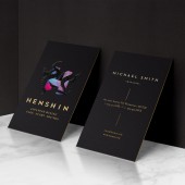
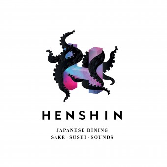
| DESIGN NAME: Henshin PRIMARY FUNCTION: Food and Beverage Branding INSPIRATION: Drawing Inspiration from the Japanese word for Transformation/Trans UNIQUE PROPERTIES / PROJECT DESCRIPTION: Located in one of the five-star hotels in Jakarta, Henshin is a Japanese restaurant that offers a contemporary dining experience with an edge. Designs and naming revolved around the meaning to change or to transform, and it is made famous in Japanese comic books and tv shows. The black dancing octopus is the mascot which created for the restaurant, and it is the protagonist in the story. This mascot is a reoccurring character that left the biggest impression since the concept stage. It offers high-end, luxury, exquisite, and most importantly it houses the hidden nightlife culture of Japan. OPERATION / FLOW / INTERACTION: The goal is to create a strong restaurant branding through an extraordinary dining experience to customers. Not only on the food itself, but the interaction should also go through from the sensation of each customer, like sounds, smell, visuals, lightings and the touches. The design also considers every single detail, like the choice of paper and various printing effects, will bring you a different feel while you are using the menu. PROJECT DURATION AND LOCATION: The project started in 2017 and this restaurant is located in Jakarta, Indonesia. FITS BEST INTO CATEGORY: Graphics, Illustration and Visual Communication Design |
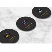
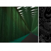
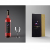
PRODUCTION / REALIZATION TECHNOLOGY: The design starts with numbers of illustration sketches of different layout of tentacle and letter H. The final symbol was finalised in Illustrator to give it a crisp and clean line, and the spray patterns on the letter "H" was later modified in Photoshop. The same design language being used on the applications, such as coasters, wine packaging, menu and etc. Except for all the graphics applications, the design also influences the other areas of interior space. A set of sea creature pattern was created to etching on the entrance corridor of the restaurant. All sketches were done by hand and finalised in illustrator with exact wall dimensions provided by the ID team. SPECIFICATIONS / TECHNICAL PROPERTIES: A general dimension idea for the concept stage as below, coaster design: 120mm x 120mm Wine label: 180mm x 180mm Menu: 250mm x 400mm Name card:55mm x 90mm TAGS: Henshin, Japanese restaurant, Food and Beverage branding, logo design, graphic design RESEARCH ABSTRACT: A few visits to the modern and traditional Japanese restaurants in Tokyo and Singapore, to get inspired by the different dining experience. Immersing the soul into the Japanese culture, cuisine and studied the dining habits. The research does not only stop capturing the way of how they layout the menu but to really understand the whole dining ritual. CHALLENGE: Overall the project was joyful and educational in both the cultural and design sense. Having Experience, a fraction of what is it like living in Japan and having fun designing the tattoo-like illustrations for the corridor. Although this was just one of the initial ideas which we proposed in the early concept stage, and we had explored on something else by requests of clients, we still think that this could have been the best option for them. The final logo was more on a tattoo-like H symbol full of sea creature elements, and it is very refined and details. ADDED DATE: 2019-02-27 17:40:48 TEAM MEMBERS (2) : Angela Lu Zhang and Nico Xu YiFei IMAGE CREDITS: Interior rendering provided by Silverfox Studios HBA HBA Graphics PATENTS/COPYRIGHTS: Nico Xu YiFei Angela Lu Zhang |
||||
| Visit the following page to learn more: http://marsdesignsg.com/ | |||||
| AWARD DETAILS | |
 |
Henshin Food and Beverage Branding by Mars Design Consultants is Winner in Graphics, Illustration and Visual Communication Design Category, 2018 - 2019.· Press Members: Login or Register to request an exclusive interview with MARS DESIGN CONSULTANTS. · Click here to register inorder to view the profile and other works by MARS DESIGN CONSULTANTS. |
| SOCIAL |
| + Add to Likes / Favorites | Send to My Email | Comment | Testimonials | View Press-Release | Press Kit |

