Amigo's Kitchen Restaurant by Amruta Daulatabadkar Architects |
Home > Winners > #80490 |
 |
|
||||
| DESIGN DETAILS | |||||
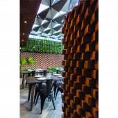
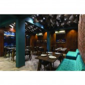
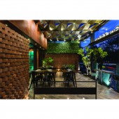
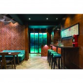
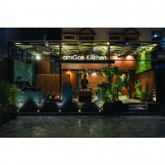
| DESIGN NAME: Amigo's Kitchen PRIMARY FUNCTION: Restaurant INSPIRATION: •A young enthusiast client, with zeal of coming up with totally new concept for restaurant with expectations of experimenting approach. •Design development started from roof design with inspiration from an idea of fetching in natural light through alternative opening flaps in diagonal grid. •Use of locally available affordable material like metal sheet, wire cut bricks and local craftsmen for execution. UNIQUE PROPERTIES / PROJECT DESCRIPTION: •A small given space about(1160 sq.ft.) design with variety of seating areas and ambience that would generate inviting and comfortable space for family as well as young patrons. project cost is about 1700/ sqft •Location on a busy Road was a challenge in itself, to segregate it from noise disturbance, proving privacy as well as creating an open and inviting entrance. •Design was executed with the help of local craftsmen and locally available material used in various form. OPERATION / FLOW / INTERACTION: The spatial layout was kept simple and linear, connecting indoor and outdoor spaces. 1160 sqft restaurant area includes indoor seating , outdoor seating; step down seating and mock tail section. Outdoor parapet with art installation, brick partitions, glass partition and a cash counter are placed parallel but in staggered pattern in plan to increase visual connectivity from in and out. PROJECT DURATION AND LOCATION: the project was started on15 January 2013 in aurangabad and finished on 23 april 2017. FITS BEST INTO CATEGORY: Interior Space and Exhibition Design |
PRODUCTION / REALIZATION TECHNOLOGY: •material selection: The material selection consciously veers towards an experimental approach with the use of locally available and affordable material Like metal sheet were used for roofing, art work and panelling. (Manually rusted on site to resemble corten steel effect) •Glass partition was used for visually connecting indoor and outdoor sitting spaces and visual expansion of spaces. •Wire cut bricks were used for partition between kitchen and indoor sitting space as well as between step down sitting and toilet in outdoor section. •A green wall and metal art work were used as welcoming feature. •Vitrified flooring as flooring throughout indoor and outdoor area. •Introducing colored bajara glass to add in texture and break monochromatic color theme. •Methodologies: Design development started from roof design with inspiration from an idea of fetching in natural light through alternative opening flaps in diagonal grid. Outdoor roof was developed with fabricated frame work in diamond shaped grid followed by internal roof in m.s sheet folds with help of local fabricator, making it affordable. • Diagonal cuts were made in diamond shaped metal sheet. Sheet edges were welded to frame work and the cut panels were folded inwards to fetch in natural light. •Wire cut bricks were used in partitions with varied brick bonds. •Dynamic approach was brought in design through tilted axis in roof, flooring and laying of brick bond. •Colored bajara glass was introduced to add in texture. •Wall art as step down seating backdrop was created by jhari work in brick wall. . tables ,consoles,mock tail counter,sofas were customised .while chairs were procured. light design for indoor & outdoor was considered and laid accordingly,to avoid the shadow effects created by roof metal panels. SPECIFICATIONS / TECHNICAL PROPERTIES: restaurant area (sitting arrangement )-107 sqm restaurant area (sitting arrangement +kitchen & utility)-163 sqm TAGS: amigo’s kitchen, restaurant, aurangabad, Indian restaurant RESEARCH ABSTRACT: •A small given space about(1160 sq.ft.) design with variety of seating areas and ambience that would generate inviting & comfortable space for family as well as young patrons. •Location on a busy Road was a challenge in itself, to segregate it from noise disturbance, proving privacy as well as creating an open and inviting entrance. •Involving local craftsmen •Affordable material in various forms and making with affordable techniques. CHALLENGE: •limited budget •time constraint •as located on medium heavy traffic flow road, entrance required a screening as well as it had to be inviting . •to create an ambience that would generate interest & be relevant to young patrons (heavy pedestrian student flow) as well as family visiting the restaurants. •to create variety of spaces in existing limited area. •to increase visual connectivity and visual expansion of small space. •Experimental approach with help of local craftsmen and locally available affordable material. ADDED DATE: 2019-02-27 14:09:25 TEAM MEMBERS (3) : Principal Architect : amruta daulatabadkar , Design team : amruta daulatabadkar , mitali parmar and IMAGE CREDITS: Photographer : phxindia/ ira gosalia |
||||
| Visit the following page to learn more: https://bit.ly/2SxK878 | |||||
| AWARD DETAILS | |
 |
Amigo's Kitchen Restaurant by Amruta Daulatabadkar Architects is Winner in Interior Space and Exhibition Design Category, 2018 - 2019.· Read the interview with designer Amruta Daulatabadkar Architects for design Amigo's Kitchen here.· Press Members: Login or Register to request an exclusive interview with Amruta Daulatabadkar Architects. · Click here to register inorder to view the profile and other works by Amruta Daulatabadkar Architects. |
| SOCIAL |
| + Add to Likes / Favorites | Send to My Email | Comment | Testimonials | View Press-Release | Press Kit |
Did you like Amruta Daulatabadkar Architects' Interior Design?
You will most likely enjoy other award winning interior design as well.
Click here to view more Award Winning Interior Design.


