DESIGN NAME:
Helping Hands
PRIMARY FUNCTION:
Concept
INSPIRATION:
There are about 140,000 people in Germany who are dependent on sign language interpreters in everyday life. Communicative problems become particularly blatant when visiting a doctor, in the hospital, after an operation and in a medical emergency. Misunderstandings, information deficits and not least the insecurity of the deaf can result.
UNIQUE PROPERTIES / PROJECT DESCRIPTION:
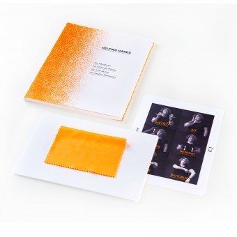
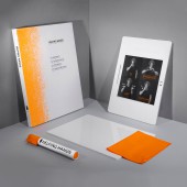
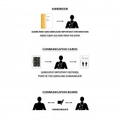
How can design sensitize and help create accessibility? In order to establish communication with deaf people, a concept was developed in which the sign language is not learned but applied situationally and subject-specific. After reading the book, readers can self-confidently apply their first gestures. A toolkit consisting of a handbook, communication board and maps, as well as an app sensitizes medical professionals to deal with deaf people and provides necessary subject-specific gestures.
OPERATION / FLOW / INTERACTION:
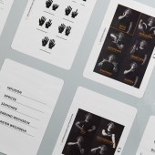
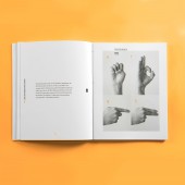
Medical professionals gain an overview of the subject by reading the handbook. Sorted by topics, essential vocabulary is learned. There are cards with the appropriate medical questions which can be clarified, for further support in communication. Also a communication board allows written exchange. This board remains with the deaf person, so important questions can be written down. For a better understanding, the vocabulary is summarized in an app, so the exact movements can be understood more precisely.
PROJECT DURATION AND LOCATION:
The project began in May 2018 and ended in August 2018 in Ravensburg, Germany.
FITS BEST INTO CATEGORY:
Social Design
|
PRODUCTION / REALIZATION TECHNOLOGY:
For a strong identity, the manual is printed on bold art paper in grayscale with special color neon orange.
The communication board consists of disinfectable white acrylic glass with rounded corners. The communication cards are printed on disinfectable and tear-resistant cardboard.
SPECIFICATIONS / TECHNICAL PROPERTIES:
Width 180 mm x Height 240 mm
TAGS:
Helping Hands, Social Design, Sign Language, Accessibility, Communication Concept, Handbook, Interaction, Deaf
RESEARCH ABSTRACT:
An important part were interviews and surveys with all concerned. Surveys in doctors' offices have been made on the frequency of deaf patients. Nurses and paramedics were asked about key vocabulary and content. Last but not least, deaf people were asked about their needs during a hospital stay. The most important content was selected to create a concept which was characterized by one thing above all: simplicity. This is intended to keep the entry barrier for medical staff low.
CHALLENGE:
From a designers point of view it was challenging to treat function, design and emotion equally. To visualize the sign language a semantic solution had to be found. Furthermore, accessibility regulations were restrictive for the design.
ADDED DATE:
2019-02-27 12:13:41
TEAM MEMBERS (1) :
IMAGE CREDITS:
LUCRA Designstudio, 2018.
|
