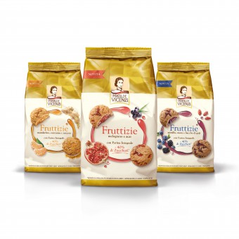
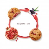
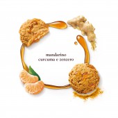
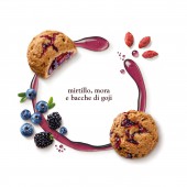
Matilde Vicenzi Fruttizie by Giulia De Andreis |
Home > Winners > #80331 |
| CLIENT/STUDIO/BRAND DETAILS | |
 |
NAME: Matilde Vicenzi PROFILE: A big Company, family-run since 1905 brings the excellence of Italian Fine Pastry in the world. The secret of the goodness of Matilde Vicenzi’s pastries is the excellence of the raw materials. These are blended to perfection according to an age-old Italian tradition. |
| AWARD DETAILS | |
 |
Matilde Vicenzi Fruttizie by Giulia De Andreis is Winner in Packaging Design Category, 2018 - 2019.· Read the interview with designer Giulia De Andreis for design Matilde Vicenzi here.· Press Members: Login or Register to request an exclusive interview with Giulia De Andreis. · Click here to register inorder to view the profile and other works by Giulia De Andreis. |
| SOCIAL |
| + Add to Likes / Favorites | Send to My Email | Comment | Testimonials | View Press-Release | Press Kit |
Did you like Giulia De Andreis' Packaging Design?
You will most likely enjoy other award winning packaging design as well.
Click here to view more Award Winning Packaging Design.


