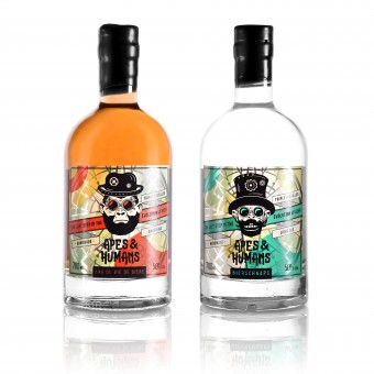
Apes & Humans Packaging Design Label by Making Sense Studio |
Home > Winners > #80198 |
 |
|
||||
| DESIGN DETAILS | |||||
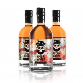
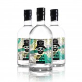
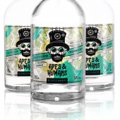
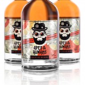
| DESIGN NAME: Apes & Humans Packaging Design PRIMARY FUNCTION: Label INSPIRATION: Our inspiration came from Apes theory. Just as human evolution the evolution of beer had it's long journey. Eau de vie de biere has both - old and unique recipes combined with modern science technologies. Bierbrand or eau de vie de biere is a spirit drink obtained exclusively by direct distillation of fresh single malt beer. The process of preparing such an alcohol is delicate and requires craftsmanship. Beverages are twice distilled and further kept in Oak barrels to achieve a full rich taste flavour. UNIQUE PROPERTIES / PROJECT DESCRIPTION: It's a soul of beer. It's the last step between beer and high volume spirit. We call it the last step in the evolution of beer. We have created different characters for each taste and combined steampunk with a modern twist just to show how modern technologies can transform old standards. We wanted to be it different, bright and loud in the shelves. Just as different as the product itself. OPERATION / FLOW / INTERACTION: Due unique and loud approach the product stands out on spirit shelves. PROJECT DURATION AND LOCATION: The project started in September 2018 and finished in February 2019. The design was done in Klaipeda and production in Kaunas. FITS BEST INTO CATEGORY: Packaging Design |
PRODUCTION / REALIZATION TECHNOLOGY: Glass bottle, wax, cork closure. Labels were printed in 5 Pantone flexography. Additional technologies such as 3D screen print and extra metallic prints were used to highlight the details. SPECIFICATIONS / TECHNICAL PROPERTIES: Bottle capacity: 700 ml. Label dimensions: 98 (w) x 88 (h) mm TAGS: Alcohol packaging, Label design, Beverage packaging, Package Design, Drinks packaging design, Steampunk, Illustration RESEARCH ABSTRACT: We came to conclusion that it has to be unique Ape characters for each taste. At the start we tried different design styles and were leaning to more standard label approach. However due product and it's mix of old recipes, evolution and modern science we needed to find a way to represent it all in one. It was clear that product has to stand out on shelves, grab attention and keep it's own unique character. CHALLENGE: Was a bit of challenge to combine completely different design styles. Due niche product there are not a lot of other products in the market to compare. Attention to details needed more approach. Due screen print technology we could't use more detailed illustrations so needed to find the best option and solution to accomplish good result. ADDED DATE: 2019-02-27 07:16:45 TEAM MEMBERS (2) : Designer: Deividas Sliazas and Designer: Alina Vengalyte IMAGE CREDITS: Photographer Alina Vengalyte |
||||
| Visit the following page to learn more: https://makingsensestudio.com | |||||
| AWARD DETAILS | |
 |
Apes & Humans Packaging Design Label by Making Sense Studio is Winner in Packaging Design Category, 2018 - 2019.· Press Members: Login or Register to request an exclusive interview with Making Sense Studio. · Click here to register inorder to view the profile and other works by Making Sense Studio. |
| SOCIAL |
| + Add to Likes / Favorites | Send to My Email | Comment | Testimonials | View Press-Release | Press Kit |

