DESIGN NAME:
Beauty of Integration
PRIMARY FUNCTION:
Office
INSPIRATION:
The interior is mainly based on Japanese simple and industrial trends, corresponding to the company’s purpose: With people as the foundation to allow for symbiosis between beauty and life. The three-storey spatial planning and looks of style applied simple materials with partial elevated space to construct the venue, where the solid effort placed on the spatial layout achieved the adequate planning of the user space.
UNIQUE PROPERTIES / PROJECT DESCRIPTION:
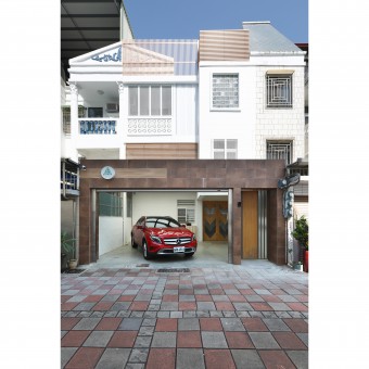
This is an interior design office planning project which renovates a close to 3 decades old house, the external looks presents a fusion of Tainan’s diversified historical cultivation – a symbiosis of Dutch, Chinese and Japanese cultures – using Taiwan’s unique floral tiles, Japanese wooden grids and iron window grill aesthetics to blend into regional landscape for the conduction of aesthetical renovation.
OPERATION / FLOW / INTERACTION:
The internal cabinets of the entire building applied systematic cabinets with green constructional materials to reduce Formaldehyde pollution. As such, environmental issues and usage functions are also emphasized over other design aspects.
PROJECT DURATION AND LOCATION:
The project finished in Jun. 2018 in Tainan City, Taiwan.
FITS BEST INTO CATEGORY:
Interior Space and Exhibition Design
|
PRODUCTION / REALIZATION TECHNOLOGY:
The entrance gate on the ground floor features a W, which is combined using the implications of victory and wide, fulfilling the central idea of devoting in creating win-win situations and open design attitude. The combination of solid wood, glass and thin stone panels is applied to bring out the design style of “mixed materials”, conveying the principle of “design has no boundary”. The 6m elevated office space not only features excellent airflow and lighting but also allows the extended space to lead imagination for an unrestrained wild gallop.
SPECIFICATIONS / TECHNICAL PROPERTIES:
The space is 263 square meters
TAGS:
Interior Design,Commercial Space,Public,Office
RESEARCH ABSTRACT:
There are table, chairs and open bookshelf on the skywalk to the end of the corridor on the second floor, where one may overlook the office area on the ground floor while working or taking a break here. One may also converse directly, where the design symbolizes a lack of hierarchical classification, using spatial renovation to surmount the gap and cultivate good teamwork. The original Japanese tatami room is kept to setup the Chinese-style director’s office. The third floor is based on the design concept of B&B, which may be used in private or for entertaining guests.
CHALLENGE:
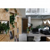
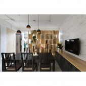
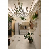
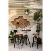
One side of the office space uses recycled wood-chip material to produce the eco-friendly bookshelf which may also act as a partition with brilliant light transmittance in order to separate the meeting room and break room at the back. The wall constructed using Diatomaceous earth, cast stone and red bricks also features a display function, while the Diatomaceous earth and the various potted plants suspend indoor has the function of regulating moisture and air quality.
ADDED DATE:
2019-02-27 06:59:00
TEAM MEMBERS (1) :
LIN,YU-CHIEH
IMAGE CREDITS:
Jimmy
|
