Tailored Narrative Residential by STUDIO ONE |
Home > Winners > #79857 |
 |
|
||||
| DESIGN DETAILS | |||||
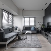
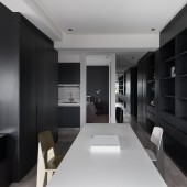
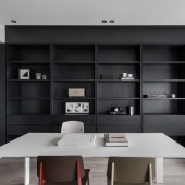
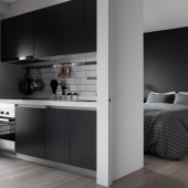
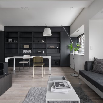
| DESIGN NAME: Tailored Narrative PRIMARY FUNCTION: Residential INSPIRATION: The client from this project is a fashion editor who adores the fashion brand Thom Browne. Therefore, the inspiration and design strategies towards this project were derived from the well-known feature of this brand, a tailored brand that emphasizes on sleek, proportion and the color composition of gray and carbon black. The space aims to create a simple form yet contains subtle details with monochrome color scheme. UNIQUE PROPERTIES / PROJECT DESCRIPTION: This project was tailored by introducing sophisticated forms and monochrome scheme. In architectural aspect, the axial diagram in this space was set by three features. The designer adopted very limited walls to set boundaries between public and private space, while using existing beams to set blur boundaries between living, dinning and kitchen area. The tailored carbon black bookcase also serve as zone divider while it also reflects the pleating and stripes inspiration from Thom Browne, all to embodied the subtle handle of details and proportions the space was asked for. These strategies and monochrome color scheme allow defining each zone without losing the cohesive in the space. OPERATION / FLOW / INTERACTION: The project was aim to create openness with blur boundaries between private and public, zone to zones. Minimalizing walls and placing fixed installation along the wall, keep flexibilities in the center in order to create a cohesive and well-circulated flow in the space. PROJECT DURATION AND LOCATION: The project started in June 2018 and finished in August 2018 in Taipei, Taiwan. FITS BEST INTO CATEGORY: Interior Space and Exhibition Design |
PRODUCTION / REALIZATION TECHNOLOGY: Ceramic tile, oak wood, engineered hardwood flooring, metal SPECIFICATIONS / TECHNICAL PROPERTIES: 50 Sq m² TAGS: Interior design, residential, small house, monochrome, minimal, boutique, designer furniture RESEARCH ABSTRACT: Exploring the method of maximizing a small space by introducing minimal architectural walls and using fixed installation to serve as space or zone divider. The orientation and scale of each zone were determined by studying and analyzing the client’s life habit in order to meet client’s need so anywhere in the house was utilized at its most. The space ought to represent a client’s life style and aesthetic view with designer’s well calculated planning, so not only focus on the planning side, designer also emphasized on how this house reflects client’s interest by introducing some well-known feature like pleating form client’s favorite fashion designer onto the woodwork detailing as well as applied the monochrome color scheme into the space. The space was sculptured with a sleek form and sophisticated tone. CHALLENGE: The challenge was to maximizing the small house with more possibilities. How the space or zones were defined without setting up a clear or solid boundaries is the key design objective towards this project. Also, under the monochrome color scheme, how to create warmth and visual texture in this place. ADDED DATE: 2019-02-26 19:27:08 TEAM MEMBERS (1) : IMAGE CREDITS: Photographer: MD Pursuit |
||||
| Visit the following page to learn more: https://www.studiooneinterior.com | |||||
| AWARD DETAILS | |
 |
Tailored Narrative Residential by Studio One is Winner in Interior Space and Exhibition Design Category, 2018 - 2019.· Press Members: Login or Register to request an exclusive interview with STUDIO ONE. · Click here to register inorder to view the profile and other works by STUDIO ONE. |
| SOCIAL |
| + Add to Likes / Favorites | Send to My Email | Comment | Testimonials | View Press-Release | Press Kit |

