Pure Icelandic Salmon Food by Anna Margret Sigurdardottir |
Home > Winners > #79791 |
 |
|
||||
| DESIGN DETAILS | |||||
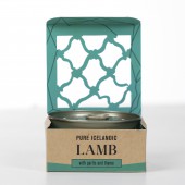
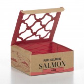
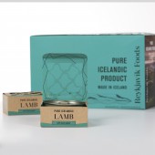
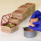
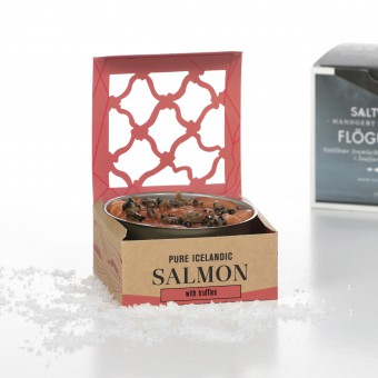
| DESIGN NAME: Pure Icelandic Salmon PRIMARY FUNCTION: Food INSPIRATION: Iceland's cold climate and isolated location, have throughout the ages led the nation towards a sustainable usage of resources. Pristine Icelandic natural resources - on land or sea - are a great source of clean ingredients. Few ingredients of the products, reflects in the design of packaging. High quality product in simple package with few colors. UNIQUE PROPERTIES / PROJECT DESCRIPTION: Pure Icelandic Salmon and Lamb. Slow cooked to secure good taste, texture and nourishment. Always made from fresh ingredients and each product with few ingredients. High quality product, freshly canned and packed with natural flavours. The design of the box reflects the quality of the product and that makes it a great souvenir for travellers to take back home. Flavour of Iceland as a beautiful gift. OPERATION / FLOW / INTERACTION: Our canned food, which is always fresh when it is canned, so our target group: Travelers in Iceland can bring it easily home and around the world. PROJECT DURATION AND LOCATION: Launched 2017 in Reykjavik, Iceland FITS BEST INTO CATEGORY: Packaging Design |
PRODUCTION / REALIZATION TECHNOLOGY: Metal can. Cardboard box and information card. SPECIFICATIONS / TECHNICAL PROPERTIES: Metal can, cardboard box and information card with the story behind the brand. Can and card goes in the box. Can contains 155g. Box: 88x88x38mm. TAGS: pure, fresh, icelandic, salmon, ingredients, RESEARCH ABSTRACT: This is how we see high quality both in product as well as the design: Pure Icelandic - means that the main ingredient is always Icelandic. Icelandic Nature both in land and see is one of the purest known in the world. The product and packaging should be clear and natural. Sustainability - we understand that without nature there would be no food, which is why we use sustainably sourced ingredients, reusable packaging and renewable energy in our production. CHALLENGE: Less is More. We decided in the beginning to keep it simple, clear and cool. The product only holds few ingredients so that was our mission for the design. The hardest thing was to keep the design simple but still keep the high quality of the product. Make the quality shine through out the product. High quality from inside the can to the outer box, as one can feel when holding the packaging. ADDED DATE: 2019-02-26 17:23:03 TEAM MEMBERS (3) : Creative Director: Anna Margrét Sigurðardóttir, CEO: Þórdís Jóhannesdóttir Whatney and Marketing Manager: Tinna Hrund Birgisdóttir IMAGE CREDITS: Image #1: Photographer Gunnar Leifur Jónasson, 2017 Image #2: Photographer Gunnar Leifur Jónasson, 2017 Image #3: Photographer Gunnar Leifur Jónasson, 2017 Image #4: Photographer Gunnar Leifur Jónasson, 2017 Video credit: Dimitri, 2017 |
||||
| Visit the following page to learn more: https://www.reykjavikfoods.com | |||||
| AWARD DETAILS | |
 |
Pure Icelandic Salmon Food by Anna Margret Sigurdardottir is Winner in Packaging Design Category, 2018 - 2019.· Read the interview with designer Anna Margret Sigurdardottir for design Pure Icelandic Salmon here.· Press Members: Login or Register to request an exclusive interview with Anna Margret Sigurdardottir. · Click here to register inorder to view the profile and other works by Anna Margret Sigurdardottir. |
| SOCIAL |
| + Add to Likes / Favorites | Send to My Email | Comment | Testimonials | View Press-Release | Press Kit |
Did you like Anna Margret Sigurdardottir's Packaging Design?
You will most likely enjoy other award winning packaging design as well.
Click here to view more Award Winning Packaging Design.


