Martini Pio Lineapelle Milano Stand by Franco Pupillo |
Home > |
 |
|
||||
| DESIGN DETAILS | |||||
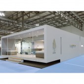
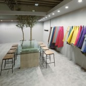
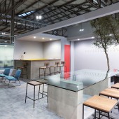
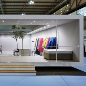
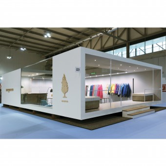
| DESIGN NAME: Martini Pio Lineapelle Milano PRIMARY FUNCTION: Stand INSPIRATION: Inspiration came from concepts of minimalist architecture, to make a stand raised from the ground. In reality it is an illusion, only the front part is raised, in fact, to access, go up the stairs and then go down inside the stand. The space has been conceived as a showroom with an important and welcoming bar area. UNIQUE PROPERTIES / PROJECT DESCRIPTION: The stand is characterized by large openings and furnishings made with Concreo concrete slabs. It is the only one with stairs in the entire Lineapelle fair. The seats and the meeting table have been designed and handcrafted specifically for this stand. Three quercus suber trees complete the furnishing of the stand. OPERATION / FLOW / INTERACTION: The allusion of a raised stand is the distinctive element that makes the stand unique. PROJECT DURATION AND LOCATION: The project started with the September 2014 edition of LINEAPELLE in Milan and is installed twice a year. FITS BEST INTO CATEGORY: Interior Space and Exhibition Design |
PRODUCTION / REALIZATION TECHNOLOGY: The structure of the stand is made of wood, while the furnishings are made of metal, wood, glass or Concreo cement panels. SPECIFICATIONS / TECHNICAL PROPERTIES: The stand measures mt. 12 x 8 h 3 TAGS: Stand, Minimal, Raised, Cement, Natural RESEARCH ABSTRACT: The research was aimed at giving a unique character to the stand, which stood out for its originality and simplicity. The goal was to give the company an innovative, quality and recognizable character. To create this project I studied the client, trying to understand his personality. The result was very positive, this stand brought other work. CHALLENGE: The challenge was to give a unique identity that could be remembered, a simple and representative stand, where the leathers could be enhanced, creating a contemporary identity. ADDED DATE: 2019-02-26 15:40:07 TEAM MEMBERS (1) : Lorenzo Fratini IMAGE CREDITS: the image #1 is the September 2014 edition, the image #2 is the September 2014 edition, the image #3 is the September 2014 edition, the image #4 is the September 2014 edition, the image #5 is the September 2014 edition. Photo by Alessandra Di Rosa |
||||
| Visit the following page to learn more: https://www.pupillo.it | |||||
| SOCIAL |
| + Add to Likes / Favorites | Send to My Email | Comment | Testimonials | View Press-Release | Press Kit |
Did you like Franco Pupillo's Trade Show Design?
You will most likely enjoy other award winning trade show design as well.
Click here to view more Award Winning Trade Show Design.


