Apartment by the Sea Residence by Behzad Kharas |
Home > Winners > #79495 |
 |
|
||||
| DESIGN DETAILS | |||||
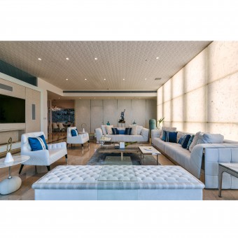
| DESIGN NAME: Apartment by the Sea PRIMARY FUNCTION: Residence INSPIRATION: The client wanted the house to be designed using white and blue as the primary colors because he was highly inspired by his visit to Santorini in Greece. Overall the whole house has a serene look. UNIQUE PROPERTIES / PROJECT DESCRIPTION: This is a sea facing apartment located in one of the most luxurious buildings in Mumbai. The client wanted the house to be designed using white and blue as the primary colors.The layout of the apartment was not changed. the design started off considering the base marble supplied by developers which is beige. Building over this palette it was decided to use white, grey, blue, silver, steel and mirror as the main colors and materials. The client wanted an eclectic fusion of modern and classical design. OPERATION / FLOW / INTERACTION: The layout of the apartment was not changed and retained to its original 4 BHK layout. We started off considering the base marble supplied by developers which is beige.Builing over this palette we decided to use white, grey, blue, silver, steel and mirror as our main colors and materials. PROJECT DURATION AND LOCATION: The project commenced in July 2016 and was completed in March 2018. It is located in Mumbai, India FITS BEST INTO CATEGORY: Interior Space and Exhibition Design |
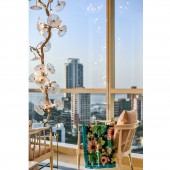
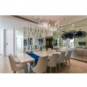
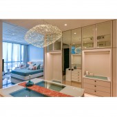
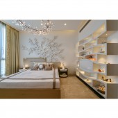
PRODUCTION / REALIZATION TECHNOLOGY: The layout of the apartment was not changed and retained to its original 4 BHK layout. The design started off considering the base marble supplied by developers which is beige. Building over this palette we decided to use white, grey, blue, silver, steel and mirror as our main colors and materials. The client wanted an eclectic fusion of modern and classical design. The living room layout was done keeping in mind the large windows available at the site. It created a pocket area of seating facing the sea with a sculptural light piece coming in the corner and framing the view towards the sea. A backlit alabaster wall was created to create mood lighting within the space. The son’s bedroom door was camouflaged with wallpaper paneling of the living room. The son’s room is kept modern using 3D molded MDF panels and a palette of white, blue and grey. The dining room is created by a wooden screen where one can keep artefacts and on the other side it abuts a transparent glass partition looking into the kitchen. The main kitchen is kept white with a long island counter. The prep kitchen abuts the main kitchen at the rear side. A long linear corridor leading towards the master bedroom had many doors which lead to various rooms. This entire corridor us camouflaged with mirrors to reduce the number of elements in the corridor. This helps in highlighting master bedroom door which is done in blue leatherite. The master bedroom has a large walk-in-wardrobe and hence colors like peach and aqua green were added to the base palette of white and grey. The daughter wanted a warmer color scheme. Hence a beige smoked teaked veneer was chosen. The daughter’s room has an artistic tree mural which forms the central focus element in her space. The guest bedroom is kept on semi-classical line using maroon and green based on the brief given by the client. SPECIFICATIONS / TECHNICAL PROPERTIES: The total area is 3,800 sq.ft. TAGS: residence, luxury tactile, RESEARCH ABSTRACT: The client wanted the house to be designed using white and blue as the primary colors because he was highly inspired by his visit to Santorini in Greece. The layout of the apartment was not changed and retained to its original 4 BHK layout. We started off considering the base marble supplied by developers which is beige.Builing over this palette we decided to use white, grey, blue, silver, steel and mirror as our main colors and materials. The client wanted an eclectic fusion of modern and classical design CHALLENGE: Restructuring the layout without chaning too much civil work ADDED DATE: 2019-02-26 09:44:43 TEAM MEMBERS (1) : Behzad Kharas IMAGE CREDITS: Mr. Prashant Bhat |
||||
| Visit the following page to learn more: http://thebnkgroup.com | |||||
| AWARD DETAILS | |
 |
Apartment by The Sea Residence by Behzad Kharas is Winner in Interior Space and Exhibition Design Category, 2018 - 2019.· Read the interview with designer Behzad Kharas for design Apartment by the Sea here.· Press Members: Login or Register to request an exclusive interview with Behzad Kharas. · Click here to register inorder to view the profile and other works by Behzad Kharas. |
| SOCIAL |
| + Add to Likes / Favorites | Send to My Email | Comment | Testimonials | View Press-Release | Press Kit |
Did you like Behzad Kharas' Interior Design?
You will most likely enjoy other award winning interior design as well.
Click here to view more Award Winning Interior Design.


