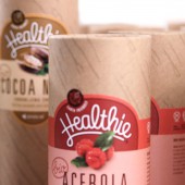
Healthie Bio Superfoods Packaging by Jure Kožuh |
Home > Winners > #79464 |
| CLIENT/STUDIO/BRAND DETAILS | |
 |
NAME: Sensilab PROFILE: Sensilab is company which is commited to consumers and their long, active and healthy life. They are a direct customer relationship food supplement brand that creates strong relationships with consumers basing on consultancy and content management tools. They not just sell products, but rather provide full-service solutions. Products are made with special care and to fullfili all consumer needs. Their concept is 360 nutrition with 4 segments: special food, beauty, sport nutrition and health which. |
| AWARD DETAILS | |
 |
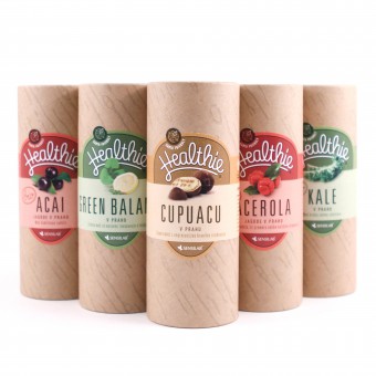
Healthie Bio Superfoods Packaging by Jure Kožuh is Winner in Packaging Design Category, 2018 - 2019.· Press Members: Login or Register to request an exclusive interview with Jure Kožuh. · Click here to register inorder to view the profile and other works by Jure Kožuh. |
| SOCIAL |
| + Add to Likes / Favorites | Send to My Email | Comment | Testimonials | View Press-Release | Press Kit |

