CHI Office Office by Benson Wu |
Home > Winners > #79412 |
 |
|
||||
| DESIGN DETAILS | |||||
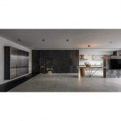
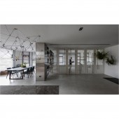
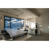
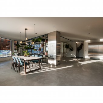
| DESIGN NAME: CHI Office PRIMARY FUNCTION: Office INSPIRATION: With the high pressure and competitive work environment in Asia, and the excessive dependence on smart devices in recent years has caused some social phenomena such as interpersonal alienation. It is very important on how to build spaces for self decompression and increase interpersonal interaction to make users open their minds, continuously improve themselves and be more creative. Therefore, CHI Design office expects to break the indifference of people with the core value of creating spaces that bring people vitality. UNIQUE PROPERTIES / PROJECT DESCRIPTION: It was originally an old house. After several former renovations, the space faces some problems such as uneven ceilings and floors, as well as disorderly compartments. Through the redesign from CHI DESIGN, it is renovated into a working space with natural charm, harmonious and leisure atmosphere. By utilizing the characteristics of four sided windows, it introduces light and improves the visual brightness. The large and perspective metal display shelf, and the stylish door dividing the office area and the public area break the impression of well defined areas of the office. The floor is paved with gray tone artesian cement that retains hand made texture. The stone TV wall connects the kitchen island dining table that is held by exquisite and irregular titanium plated stands. The thin line light decoration from the above adds the delicate splendor. The reception tables and chairs with simple and warm texture accompanied by the walls made of iron pieces hung with the green planting distribute natural vitality. OPERATION / FLOW / INTERACTION: From the building itself, exterior environment, to the compartments of different interior areas, the arrangement of the glass, stone, and metal materials blurs the boundary and shortens the distance between people and the working environment. The natural air and light are introduced to make the space look more open with the flow of air. The staff in the studio can feel the vitality from the difference between day and night and the changes of four seasons in the space, which will stimulate more creative inspirations. PROJECT DURATION AND LOCATION: The project started in July and finished in Nov. 2018 in HsinZhu, Taiwan. FITS BEST INTO CATEGORY: Interior Space and Exhibition Design |
PRODUCTION / REALIZATION TECHNOLOGY: In order to interpret the vitality and interactivity of the space, the partition materials are mainly based on the penetrating elements to break the distance between the building and exterior environment and introduces the surrounding greenery and people’s joyful laughter into the space. In the interior space, there is no distance between different areas, keeping the creative concept fermenting. The visitors will also notice the movement of staffs and feel the peaceful and carefree atmosphere. Materials with cold and warm textures, such as metal pieces, stones, and titanium plating, artesian cement floor, create a sense of agility, balancing the wooden pattern and the planting. In changes of color application, grey, white, golden color are the base of space, and further adds a sense of glamour and fashion with different depths of golden. The contrast masses, such as the delicate golden supports under the stone table, create the visually conflicting beauty. SPECIFICATIONS / TECHNICAL PROPERTIES: - TAGS: Interior, Design, Leisure style, office RESEARCH ABSTRACT: After the decoration of two or three former dwellers, the space had some problems such as fragmented compartments, uneven floors, and mixtures of different materials, disorderly pipelines, and oldness. The designer removed the solid walls first and re divided the areas after emptying the interior space. The iron cabinets were used to separate the office and reception area. The clear field division could be achieved even without the walls. The floor was elevated and paved with the exposed concrete. The pipelines of the space were also rearranged to plan the appropriate space for the office. CHALLENGE: Due to the large size of the iron display shelf with a width of more than six meters, it cannot be moved to interior space after produced by the factory. All must be made on site, and the process was delicate and time consuming. The iron shelf has several functions including display, storage, and also the planting. The material needs to be accurately calculated and cut so that the metal tube can be inserted into the iron plate. Also, the stylish door of the office is made by multiple materials such as wood, glass, perforated plate, and titanium doorknob. Each combination needs to be accurately calculated due to the different features of every material. The titanium plated doorknobs of the six doors were designed in different irregular crossed design which required a very fine method to reduce the error value. ADDED DATE: 2019-02-26 06:38:25 TEAM MEMBERS (1) : Designer: Celine Wu, Designer: Benson Wu IMAGE CREDITS: CHI Design Studio |
||||
| Visit the following page to learn more: https://www.searchome.net/designerintro. |
|||||
| AWARD DETAILS | |
 |
Chi Office Office by Benson Wu is Winner in Interior Space and Exhibition Design Category, 2018 - 2019.· Read the interview with designer Benson Wu for design CHI Office here.· Press Members: Login or Register to request an exclusive interview with Benson Wu. · Click here to register inorder to view the profile and other works by Benson Wu. |
| SOCIAL |
| + Add to Likes / Favorites | Send to My Email | Comment | Testimonials | View Press-Release | Press Kit |
Did you like Benson Wu's Interior Design?
You will most likely enjoy other award winning interior design as well.
Click here to view more Award Winning Interior Design.


