DESIGN NAME:
Villa AT
PRIMARY FUNCTION:
House
INSPIRATION:
Villa AT emphasises and enhances the strong connection to landscape, promoting the best sightlines while also preserving a sense of intimacy and privacy. ‘We take pride in how our work respects the landscape,’ says Saunders, ‘and these clients knew the site intimately; where the sun went down, the best views, where the wind was the strongest, they would paddle kayak in the mornings and evenings – they knew everything about the land.’
UNIQUE PROPERTIES / PROJECT DESCRIPTION:
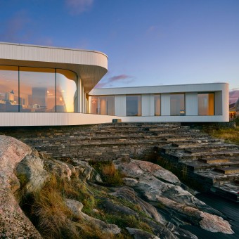
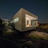
Villa AT is located on a high vantage point, with an L-shaped floor plan pivots around a long curved glass façade, offering cinematic views of the landscape. The house stands in contrast to these boxy, conventional forms with a curving façade that uses wood in a fluid, contemporary way. Thin timber slats gently curve around the façade to create strong but soft forms. From a distance, the Villa AT has a serene, minimal appearance, but up close the rough texture of timber slats become apparent.
OPERATION / FLOW / INTERACTION:
Ultimately, Villa AT emphasises and enhances the strong connection to landscape. By combining contemporary forms and techniques with traditional materials, Villa AT demonstrates how materials and techniques can enhance the close relationship between place and form.
PROJECT DURATION AND LOCATION:
Søgne, along Norway’s southern coast.
Completed in 2018.
FITS BEST INTO CATEGORY:
Architecture, Building and Structure Design
|
PRODUCTION / REALIZATION TECHNOLOGY:
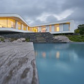
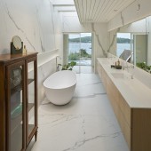
The house sits on a podium, with wraparound terraces and steps that accommodate the changes in level and a roof that extends over the external spaces to create shelter from the weather. Steps made of local stone lead down to a swimming pool and terrace overlooking the water; the pool is treated as a strong geometric element set amidst the existing natural contours. Inside, finishes and fittings use a simple, reduced palette, with white walls and wooden floors throughout. Slatted timber ceilings mirror the exterior façade, which in turn evoke the area’s traditionally built houses.
SPECIFICATIONS / TECHNICAL PROPERTIES:
- 310 m2
TAGS:
home, residence, small building
RESEARCH ABSTRACT:
The design is precisely tailored for the requirements of the clients’ family, containing three bedrooms and a guesthouse, all arranged across a single level. The clients had lived in a house on the location for many years, giving them a unique understanding of the site, the views, the climate, and the way light changed throughout the seasons.
CHALLENGE:
Saunders describes the design process as a ‘riddle.’ ‘We kept reaching solutions, but knew there was a better one,’ he says, ‘Then one day I took some cardboard and a glue gun and started sketching on that. I came up with the softer forms you see, which combine functional design with the flow of daily life.’
ADDED DATE:
2019-02-25 23:38:05
TEAM MEMBERS (6) :
Architect: Saunders Architecture - Bergen, Norway, Team Architects:Todd Saunders with Attila Béres, Márk Szőke, and Joshua Kievenaar, Interior designer: Hannes Wingate + Matt Morrison, Structural Engineer: Konstruksjonsteknikk AS and Erling Olsen, Builders: Byggm. Øyvind Bakkevold AS and Construction Supervisor: Øyvind Bakkevold
IMAGE CREDITS:
Bent René Synnevåg
|


