Soul Food Brand Identity by abnodesigns |
Home > Winners > #79093 |
 |
|
||||
| DESIGN DETAILS | |||||
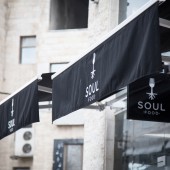
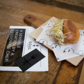
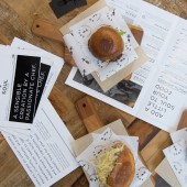
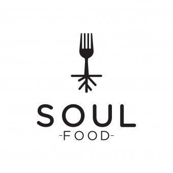
| DESIGN NAME: Soul Food PRIMARY FUNCTION: Brand Identity INSPIRATION: Soul Food uses double entendre to evoke both African American cuisine that originated in Deep South and food that is good for the soul. Inspired by upscale, urban street food with a fusion twist, the designers created a single-colour silhouette of a four-pronged fork with an abstract representation of roots extending from its handle. The fork and the roots connect to represent soul food. The logo is incorporated throughout the brand identity. UNIQUE PROPERTIES / PROJECT DESCRIPTION: The name of the restaurant Soul Food resonates with the menu, which combines Southern-style BBQ sliders and fried chicken on waffles with traditional Middle Eastern ingredients like pomegranate molasses, sumac, and tahini. In response, the design explores the connection between food and culture. Thus, the designers created a logo, in black-and-white monochrome, resembling a fork with a modern, minimalist root system. OPERATION / FLOW / INTERACTION: Customers interact with the brand identity in the restaurant. The signage, menu, uniforms and business cards convey a bold visual imagery in black and white; the wax-paper wrappers and cardboard packaging serve as tactile elements to enhance the dining experience. PROJECT DURATION AND LOCATION: The project was carried out in Amman, Jordan, between February 2017 and April 2017. The restaurant opened on September 2017. FITS BEST INTO CATEGORY: Graphics, Illustration and Visual Communication Design |
PRODUCTION / REALIZATION TECHNOLOGY: The designers used Adobe Illustrator to design the logo, physical designs and non-physical designs. Business cards are printed on 350 gsm wood-free black paper, with the symbol applied using a spot UV coating. Menus are digitally printed with black ink on glossy 150 gsm paper. Wax-paper wrappers are branded by printing black ink on a mix of transparent and recycled wax paper. Take-away boxes, made of recycled paper with black ink printing, are assembled by the restaurant staff. SPECIFICATIONS / TECHNICAL PROPERTIES: The designers created a dozen different design units in different sizes and materials. The business cards are 90 mm x 50 mm. The menus are A4, folded in half. The wax-paper wrappers are A5. The take-away boxes are two different sizes; one square and one rectangle. TAGS: branding, restaurant, packaging, menus, stationary RESEARCH ABSTRACT: The menu of the restaurant was inspired by a restaurant in Barcelona, Spain, in 2017. The designers visited numerous restaurants to think about the idea of soul food. This inspired the idea for the symbol, creating roots on a fork to represent soul food, meaning food stemming from the roots, that has depth. The designers created the concept and then adapted it graphically. The fork with roots resonated the most with the client. CHALLENGE: In terms of design, the challenge was to create a hip and modern logo that also resembles the free-spirited feel of soul food. The strong brand identity helped the restaurant successfully market its menu, which is a fusion of traditional local ingredients, global street food and soul food. ADDED DATE: 2019-02-25 15:27:36 TEAM MEMBERS (2) : Abeer Zoumot and Noor Issa IMAGE CREDITS: All Images, Abeer Zoumot and Noor Issa, Soul Food, 2019. |
||||
| Visit the following page to learn more: http://bit.ly/2Cvo5c9 | |||||
| AWARD DETAILS | |
 |
Soul Food Brand Identity by Abnodesigns is Winner in Graphics, Illustration and Visual Communication Design Category, 2018 - 2019.· Read the interview with designer abnodesigns for design Soul Food here.· Press Members: Login or Register to request an exclusive interview with abnodesigns. · Click here to register inorder to view the profile and other works by abnodesigns. |
| SOCIAL |
| + Add to Likes / Favorites | Send to My Email | Comment | Testimonials | View Press-Release | Press Kit |
Did you like Abnodesigns' Graphic Design?
You will most likely enjoy other award winning graphic design as well.
Click here to view more Award Winning Graphic Design.


